How to Customize ProgressView Track Color in iOS SwiftUI
The ProgressView in SwiftUI is a useful UI element for displaying the progress of ongoing tasks. While it offers a default style, you might want to customize it to better fit your app’s design. One common customization is changing the track color.
In this blog post, we’ll explore how to customize the track color of a ProgressView in SwiftUI using custom styles.
What is the Track in ProgressView?
The track is the background over which the progress indicator moves. In a linear ProgressView, it’s the line that fills as the task progresses. In a circular ProgressView, it’s the circle that gets filled.
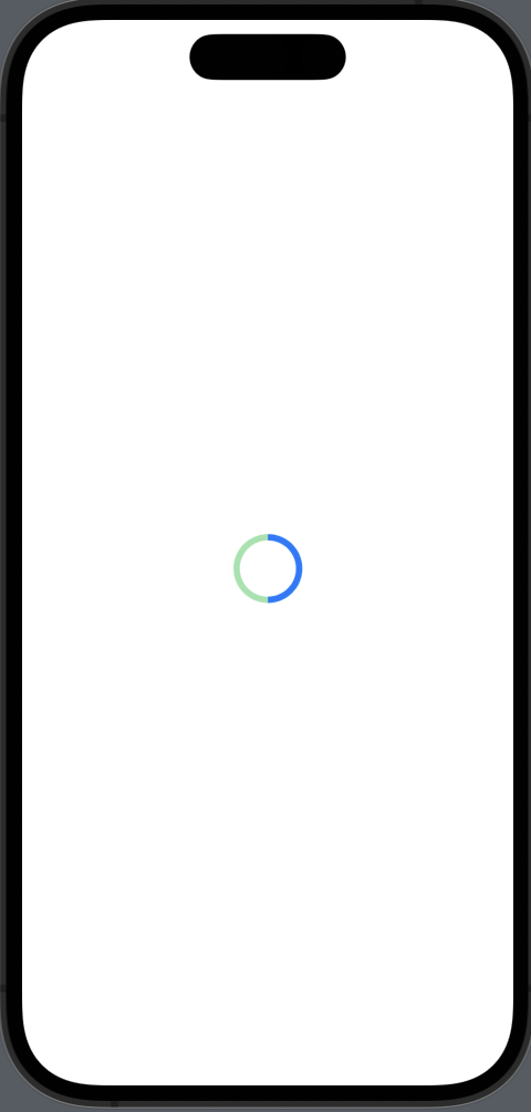
Customize Track Color in Circular ProgressView
You can’t change the track color of ProgressView directly. Hence, it’s better to use a custom ProgressView style to achieve the desired result.
Example Code
import SwiftUI

struct CustomCircularProgressViewStyle: ProgressViewStyle {
    func makeBody(configuration: Configuration) -> some View {
        ZStack {
            Circle()
                .stroke(Color.green.opacity(0.5), lineWidth: 5)
            Circle()
                .trim(from: 0.0, to: CGFloat(configuration.fractionCompleted ?? 0))
                .stroke(Color.blue, lineWidth: 5)
                .rotationEffect(.degrees(-90))
        }
        .frame(width: 50, height: 50)
    }
}

struct ContentView: View {
    var body: some View {

            ProgressView(value: 0.5, total: 1.0)
                .progressViewStyle(CustomCircularProgressViewStyle())
    }
}
Code Explanation
ZStack: We use aZStackto layer our circles.Circle().stroke(Color.green.opacity(0.5), lineWidth: 5): This creates the background circle, which acts as the track. We set its color to a semi-transparent green.Circle().trim(from: 0.0, to: CGFloat(configuration.fractionCompleted ?? 0)): This is the progress indicator itself, and we set its color to blue.
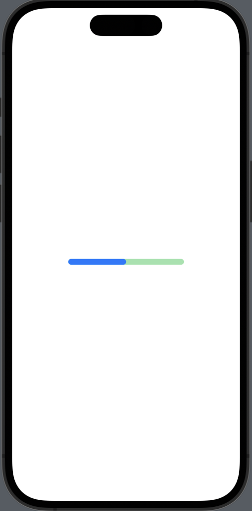
Customize Track Color in Linear ProgressView
Example Code
import SwiftUI

struct CustomLinearProgressViewStyle: ProgressViewStyle {
    func makeBody(configuration: Configuration) -> some View {
        ZStack(alignment: .leading) {
            RoundedRectangle(cornerRadius: 5)
                .fill(Color.green.opacity(0.5))
            RoundedRectangle(cornerRadius: 5)
                .fill(Color.blue)
                .frame(width: CGFloat(configuration.fractionCompleted ?? 0) * 200)
        }
        .frame(width: 200, height: 10)
    }
}

struct ContentView: View {
    var body: some View {

            ProgressView(value: 0.5, total: 1.0)
                .progressViewStyle(CustomLinearProgressViewStyle())
    }
}
Code Explanation
ZStack(alignment: .leading): We use aZStackwith leading alignment to layer our shapes.RoundedRectangle(cornerRadius: 5).fill(Color.green.opacity(0.5)): This creates the background of the progress bar, which acts as the track. We set its color to a semi-transparent green.RoundedRectangle(cornerRadius: 5).fill(Color.blue): This is the progress bar itself, and we set its color to blue.
Customizing the track color of a ProgressView in SwiftUI is straightforward when you use custom styles. This approach provides you with the flexibility to change the track color and make the ProgressView align perfectly with your app’s design.