How to Create Custom ProgressView Styles in iOS SwiftUI
While SwiftUI provides a default ProgressView that works well for most use-cases, there may be times when you need something more customized. Fortunately, SwiftUI allows you to create custom styles for ProgressView.
In this blog post, we’ll walk through the process of creating a custom ProgressView style, complete with examples and best practices.
What is a ProgressView?
A ProgressView in SwiftUI is a UI element that displays the progress of an ongoing task. It can be either determinate, showing a specific percentage of completion, or indeterminate, displaying a general waiting indicator.
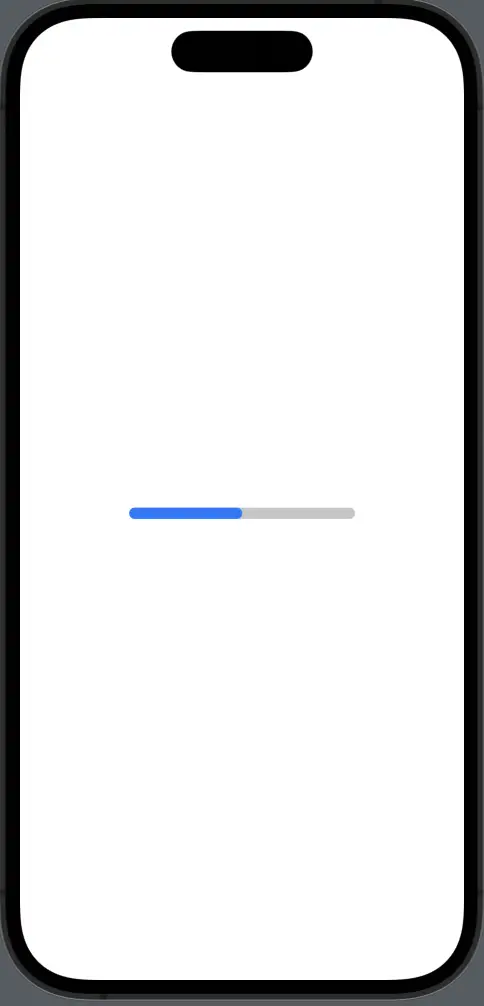
Create a Custom Linear ProgressView Style in SwiftUI
Example: Custom Linear Style
Let’s start by creating a custom linear ProgressView style.
import SwiftUI

struct CustomLinearProgressViewStyle: ProgressViewStyle {
    func makeBody(configuration: Configuration) -> some View {
        ZStack(alignment: .leading) {
            RoundedRectangle(cornerRadius: 5)
                .fill(.gray.opacity(0.5))
            RoundedRectangle(cornerRadius: 5)
                .fill(.blue)
                .frame(width: CGFloat(configuration.fractionCompleted ?? 0) * 200)
        }
        .frame(width: 200, height: 10)
    }
}

struct ContentView: View {
    @State private var showProgress = false

    var body: some View {
        ProgressView(value: 0.5, total: 1)
            .progressViewStyle(CustomLinearProgressViewStyle())
    }
}
We define a new struct CustomLinearProgressViewStyle that conforms to ProgressViewStyle. Inside the makeBody function, we create a ZStack with two RoundedRectangle views. The first one serves as the background, and the second one represents the progress.
ZStack(alignment: .leading): We use aZStackwith leading alignment to layer our shapes.RoundedRectangle(cornerRadius: 5).fill(.gray.opacity(0.5)): This creates the background of the progress bar with a gray color and rounded corners.CGFloat(configuration.fractionCompleted ?? 0) * 200: This expression calculates the width of the blue rectangle based on the task’s completion percentage. It multiplies the fraction completed by 200, which is the total width of theZStack.
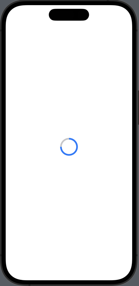
Create a Custom Circular ProgressView Style in SwiftUI
Example: Custom Circular Style
Next, let’s create a custom circular ProgressView style.
import SwiftUI

struct CustomCircularProgressViewStyle: ProgressViewStyle {
    func makeBody(configuration: Configuration) -> some View {
        ZStack {
            Circle()
                .stroke(Color.gray.opacity(0.5), lineWidth: 5)
            Circle()
                .trim(from: 0.0, to: CGFloat(configuration.fractionCompleted ?? 0))
                .stroke(Color.blue, lineWidth: 5)
                .rotationEffect(.degrees(-90))
        }
        .frame(width: 50, height: 50)
    }
}

struct ContentView: View {
    @State private var showProgress = false

    var body: some View {
        ProgressView(value: 0.75, total: 1)
            .progressViewStyle(CustomCircularProgressViewStyle())
    }
}
Similar to the linear example, we define a new struct CustomCircularProgressViewStyle that conforms to ProgressViewStyle. We use two Circle views in a ZStack to create a custom circular progress indicator.
ZStack: We use aZStackto layer our circles.Circle().stroke(Color.gray.opacity(0.5), lineWidth: 5): This creates the background circle with a gray outline.Circle().trim(from: 0.0, to: CGFloat(configuration.fractionCompleted ?? 0)): This trims the circle based on the task’s completion percentage..rotationEffect(.degrees(-90)): This rotates the circle to start the progress from the top.
Considerations
- Compatibility: Custom styles should be tested across different versions of SwiftUI and iOS to ensure they work as expected.
- Performance: Custom styles can be more resource-intensive than default styles, so use them judiciously.
Creating custom ProgressView styles in SwiftUI is a straightforward process that allows for a high degree of customization. Whether you need a linear or circular progress indicator, SwiftUI provides the flexibility to design it according to your needs.

One Comment