How to Create Rounded Rectangle in SwiftUI
SwiftUI simplifies the process of creating and manipulating shapes with just a few lines of code, and the rounded rectangle is one of the most commonly used shapes in UI design. In this blog post, we’ll discuss how to create a rounded rectangle in SwiftUI, customize its appearance, and integrate it within your layouts.
The Basics of a Rounded Rectangle
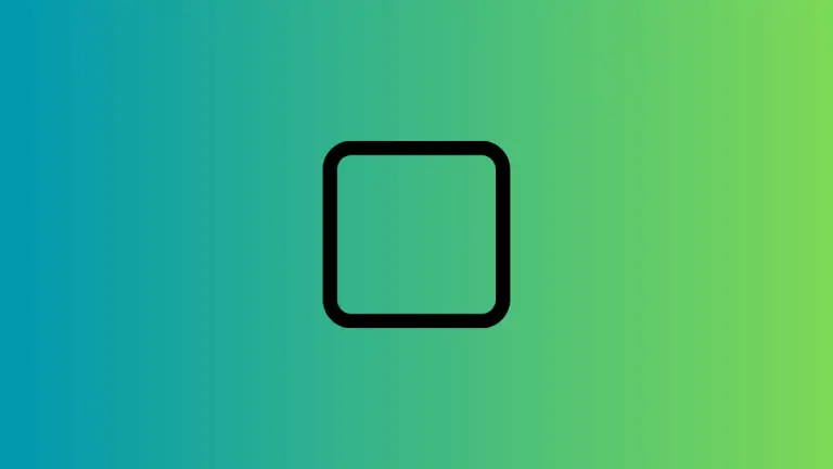
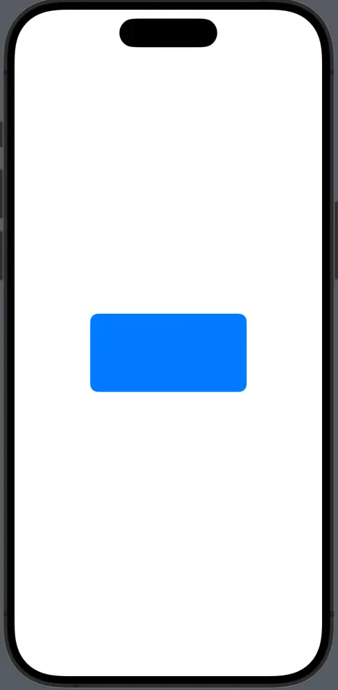
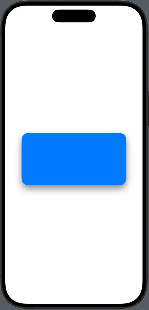
The RoundedRectangle shape is a fundamental part of SwiftUI’s shape library that can be used to create buttons, cards, and many other UI elements.
import SwiftUI

struct ContentView: View {
    var body: some View {
        RoundedRectangle(cornerRadius: 10)
            .fill(Color.blue)
            .frame(width: 200, height: 100)
    }
}
In this code snippet, we create a simple rounded rectangle with a corner radius of 10 points. The fill modifier is used to color the shape blue, and the frame modifier sets its size.
Customize Corner Radius
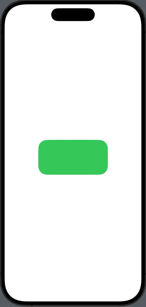
You can adjust each corner individually if you want different corner radii for your rounded rectangle.
RoundedRectangle(cornerRadius: 25, style: .continuous)
    .fill(Color.green)
    .frame(width: 200, height: 100)
The above rectangle uses a continuous corner style, which gives it a smoother, more continuous curve, compared to the default circular style which provides a standard curve.
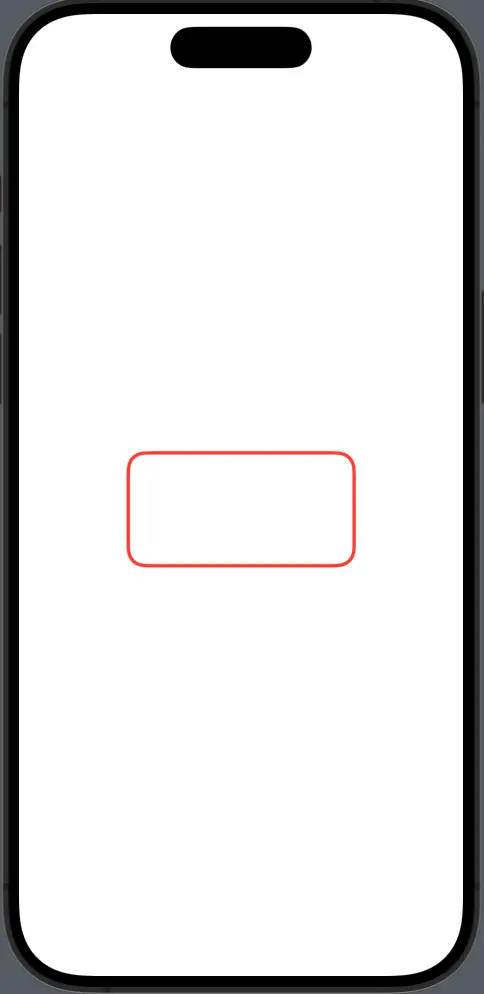
Rounded Rectangle with Border
To add a border to a rounded rectangle, use the stroke or strokeBorder modifier.
RoundedRectangle(cornerRadius: 15)
    .stroke(Color.red, lineWidth: 3)
    .frame(width: 200, height: 100)
Here, the stroke modifier adds a 3-point red border to the shape. If you want the border to be drawn inside the shape’s bounds, replace stroke with strokeBorder.
Shadow and Elevation
Adding a shadow can give your shape a lifted appearance, making it stand out.
RoundedRectangle(cornerRadius: 20)
    .fill(Color.blue)
    .shadow(color: .gray, radius: 10, x: 0, y: 10)
    .frame(width: 300, height: 150)
In this example, a gray shadow with a 10-point radius is added below the blue rounded rectangle, giving the illusion of elevation.
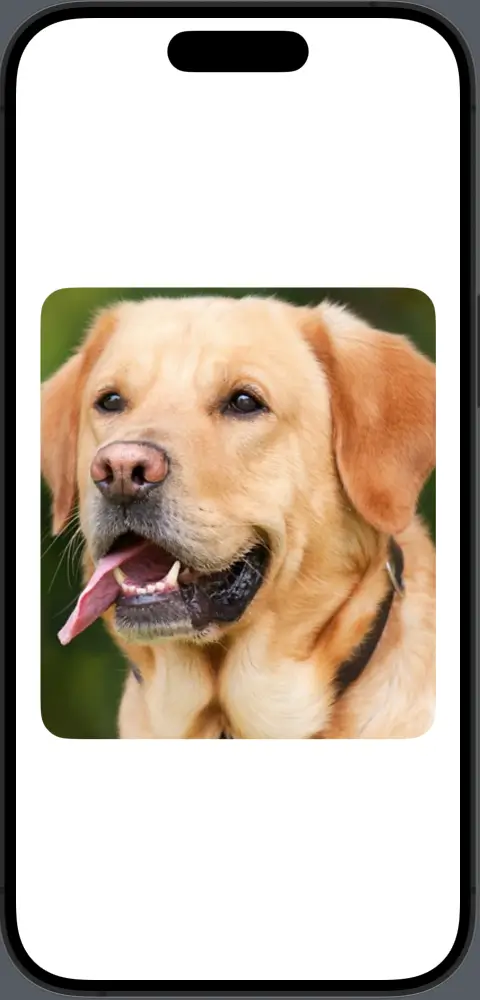
Clip Views
You can also use a RoundedRectangle to clip other views, creating a masked container with rounded corners.
import SwiftUI

struct ContentView: View {
    var body: some View {
            Image("dog")
                .frame(width: 350, height: 400)
                .clipShape(RoundedRectangle(cornerRadius: 25))
    }
}
Here, an image is clipped to fit within the bounds of a RoundedRectangle mask, so it inherits the rounded corners.
The RoundedRectangle shape in SwiftUI is versatile and can be used for a wide range of UI elements. By customizing its corner radius, style, color, and borders, you can achieve the exact look you’re aiming for.
Understanding how to work with shadows and clipping further extends the functionality of this shape, allowing for sophisticated design effects.
Whether for buttons, cards, or as a container for other views, the rounded rectangle is a key player in the SwiftUI shape library that can greatly enhance the aesthetic of your application.