How to Create Range Slider in Jetpack Compose
Range sliders are a great way to let users select a value range in Android apps. Whether implementing settings like volume controls or selecting a price bracket for products, range sliders improve the selection experience.
In this blog post, we’ll look at how to build range sliders using Jetpack Compose. We’ll go over basic implementation, styling, and best practices when creating range selector interfaces.
A range slider typically has two thumbs that indicate the start and end values of the selected range. This dual-thumb feature makes it an ideal choice for applications where users need to define a range within a bounded interval.
Range Slider in Jetpack Compose
Jetpack Compose provides the RangeSlider composable for creating range sliders. Let’s start with a basic implementation:
@Composable
fun MyRangeSlider() {
    var sliderRange by remember { mutableStateOf(0f..100f) }
    RangeSlider(
        value = sliderRange,
        onValueChange = { range -> sliderRange = range },
        valueRange = 0f..100f,
        onValueChangeFinished = {
            // launch some business logic update with the state you hold
        },
    )
}
In this example, sliderRange is a state holding the range selected by the user, initialized from 0 to 100.
Breaking Down the Code
sliderRange: This is a state variable created usingrememberthat holds the currently selected range values. It is initialized to0f..100fwhich is a range from 0f to 100f.RangeSlider: This is the range slider composable.value: Binds thesliderRangestate to the slider, so that the slider displays the currently selected range.onValueChange: Callback that is invoked whenever the user drags the slider thumbs to update the range. It takes the new range and updates thesliderRangestate.valueRange: The total range of selectable values for the slider, set from 0f to 100f.onValueChangeFinished: Callback invoked when the user releases the slider thumb after dragging. This signals that the user has finished selecting a new range.
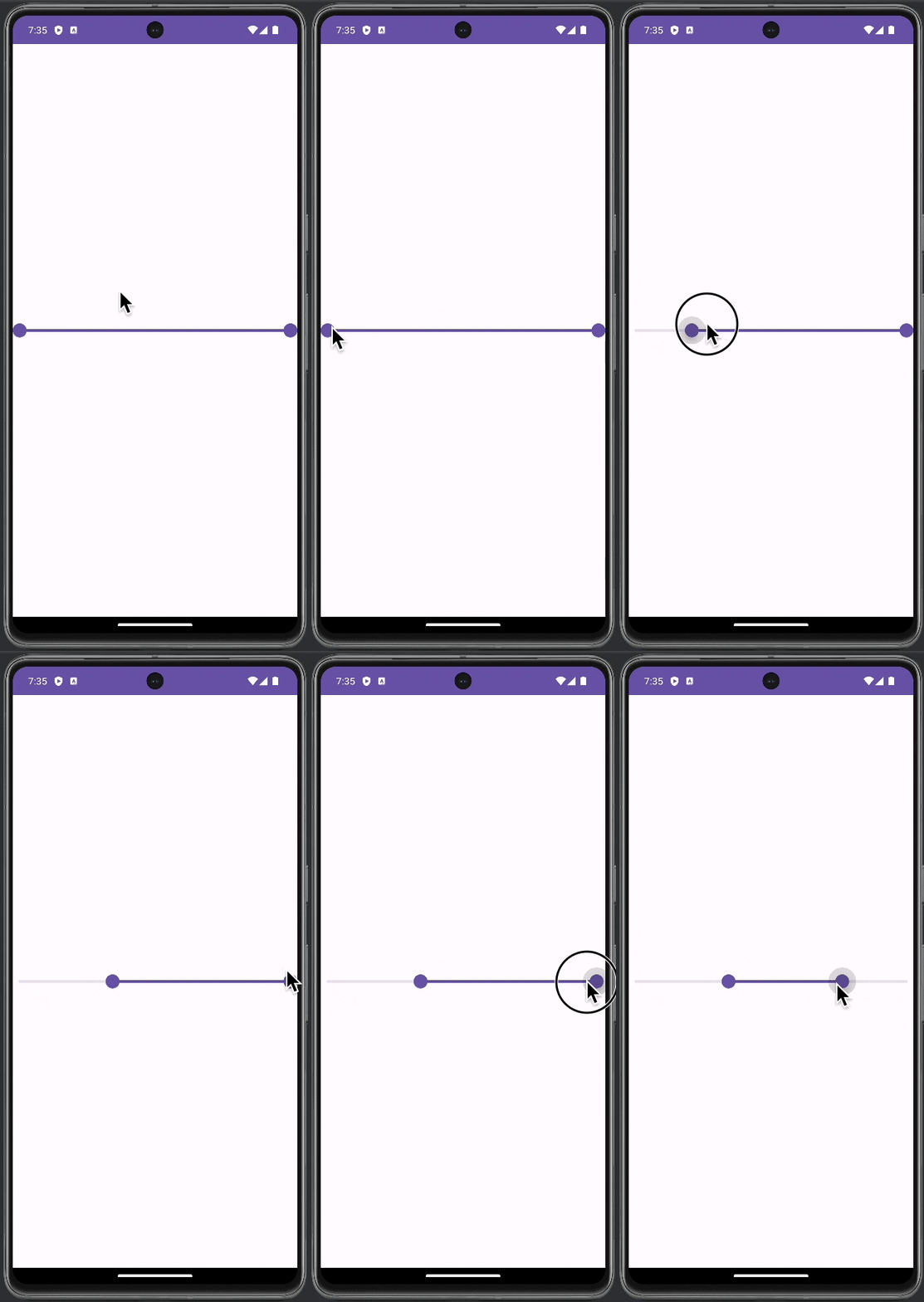
Following is the complete code for reference.
package com.example.myapplication

import android.os.Bundle
import androidx.activity.ComponentActivity
import androidx.activity.compose.setContent
import androidx.compose.foundation.layout.fillMaxSize
import androidx.compose.material3.ExperimentalMaterial3Api
import androidx.compose.material3.MaterialTheme
import androidx.compose.material3.RangeSlider
import androidx.compose.material3.Surface
import androidx.compose.runtime.Composable
import androidx.compose.runtime.getValue
import androidx.compose.runtime.mutableStateOf
import androidx.compose.runtime.remember
import androidx.compose.runtime.setValue
import androidx.compose.ui.Modifier
import com.example.myapplication.ui.theme.MyApplicationTheme

class MainActivity : ComponentActivity() {
    override fun onCreate(savedInstanceState: Bundle?) {
        super.onCreate(savedInstanceState)
        setContent {
            MyApplicationTheme {
                    Surface(
                        modifier = Modifier.fillMaxSize(),
                        color = MaterialTheme.colorScheme.background
                    ) {
                        MyRangeSlider()
                    }
            }
        }
    }
}

@OptIn(ExperimentalMaterial3Api::class)
@Composable
fun MyRangeSlider() {
    var sliderRange by remember { mutableStateOf(0f..100f) }
    RangeSlider(
        value = sliderRange,
        onValueChange = { range -> sliderRange = range },
        valueRange = 0f..100f,
        onValueChangeFinished = {
            // launch some business logic update with the state you hold
        },
    )
}
Customize the Range Slider
Style the Slider
Jetpack Compose allows you to customize the appearance of the range slider. You can modify the colors of the active and inactive tracks, the thumb, and even the shape of the thumb.
Handle the Range Values
It’s essential to effectively handle the range values for real-world applications. Consider displaying the current range values in a Text view or use them directly in your app’s logic.
Implementing a range slider in Jetpack Compose is straightforward and offers significant benefits in terms of user interaction and functionality. By customizing and handling the range values effectively, you can integrate this versatile component into your Android app to enhance user experience and interface design.

