How to Change Toggle Color in iOS SwiftUI
Toggles are essential UI elements in mobile apps. They let users switch between two states, like on and off. In SwiftUI, you can easily create a toggle, but what if you want to customize its color? In this blog post, we’ll walk you through the steps to change the color of a toggle in SwiftUI.
Default Toggle in SwiftUI
By default, a toggle in SwiftUI has a system color. It usually adapts to the app’s theme. Here’s how you create a basic toggle.
import SwiftUI

struct ContentView: View {
    @State private var isOn = true

    var body: some View {
        Toggle("Enable Notifications", isOn: $isOn).padding()
    }
}
Change Toggle Color
To change the color, you can use the .toggleStyle() modifier.
After creating the custom style, apply it to your toggle.
import SwiftUI

struct ContentView: View {
    @State private var isOn = true

    var body: some View {
        Toggle("Enable Notifications", isOn: $isOn).toggleStyle(SwitchToggleStyle(tint: .yellow)).padding()
    }
}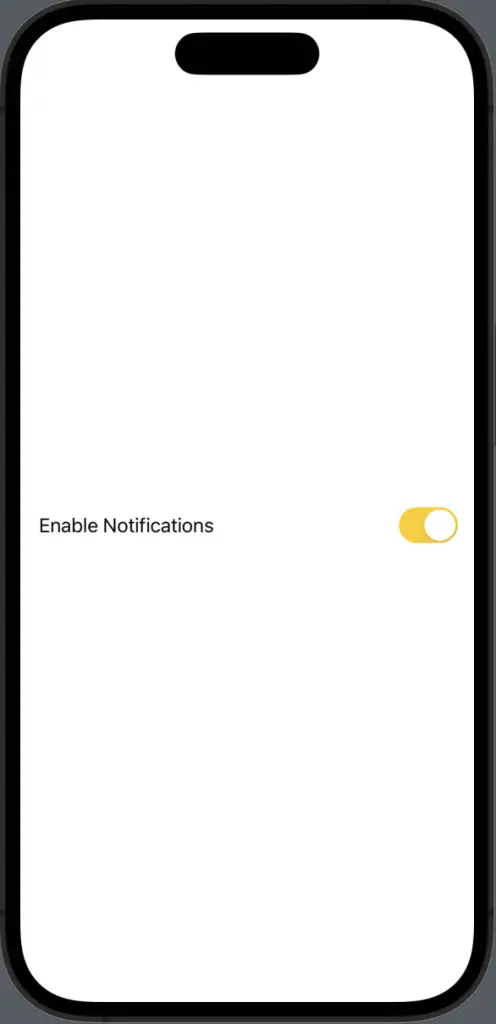
Customizing the color of a toggle in SwiftUI is straightforward. You can select SwitchToggleStyle and apply it to your toggle. This gives you full control over its appearance, including its color.

