What are Different Toggle Styles in iOS SwiftUI
Toggles are essential UI elements that allow users to switch between two states. While SwiftUI offers a default toggle style, it also provides predefined styles for customization.
In this blog post, we’ll explore these built-in toggle styles and how to implement them.
Using predefined styles saves time. It also ensures that your toggles align with platform guidelines. This can make your app feel more native and intuitive.
Default Toggle Style
The default style is what you get when you create a toggle without specifying a style. Here’s how to create a basic toggle:
import SwiftUI

struct ContentView: View {
    @State private var isOn = true

    var body: some View {
        Toggle("Default Toggle", isOn: $isOn)
    }
}
SwitchToggleStyle
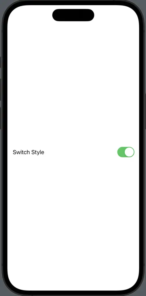
SwitchToggleStyle gives you the classic iOS switch. It’s the same as the default style on iOS but can be explicitly set for clarity.
import SwiftUI

struct ContentView: View {
    @State private var isOn = true

    var body: some View {
        Toggle("Switch Style", isOn: $isOn)
            .toggleStyle(SwitchToggleStyle()).padding()
    }
}
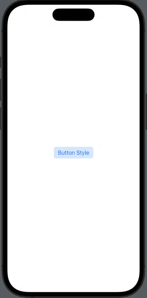
ButtonToggleStyle
ButtonToggleStyle turns the toggle into a button. Tapping the button toggles its state.
import SwiftUI

struct ContentView: View {
    @State private var isOn = true

    var body: some View {
        Toggle("Button Style", isOn: $isOn)
            .toggleStyle(ButtonToggleStyle()).padding()
    }
}
SwiftUI offers a variety of predefined toggle styles to quickly change the appearance and behavior of your toggles. When you’re developing for iOS, these styles make it easy to create a more native and intuitive user experience.