How to Add Toggle in iOS SwiftUI
Toggles are essential UI elements in mobile apps. They allow users to switch between two states, usually ON and OFF. In SwiftUI, creating a toggle is incredibly simple.
This blog post will guide you through the basics and advanced features of SwiftUI Toggle with multiple examples.
Basic Toggle Example
Code
import SwiftUI
struct ContentView: View {
@State private var isOn = true
var body: some View {
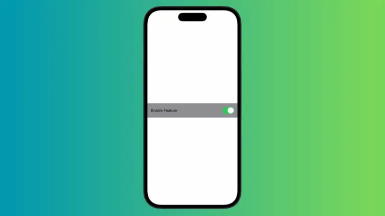
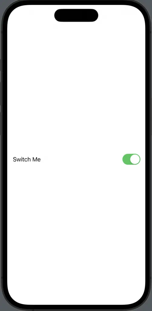
Toggle("Switch Me", isOn: $isOn)
}
}We define a state variable isOn to keep track of the toggle state. The Toggle view takes two arguments: the label and a binding to the state variable.
Customize Toggle Appearance
Code
import SwiftUI
struct ContentView: View {
@State private var isOn = true
var body: some View {
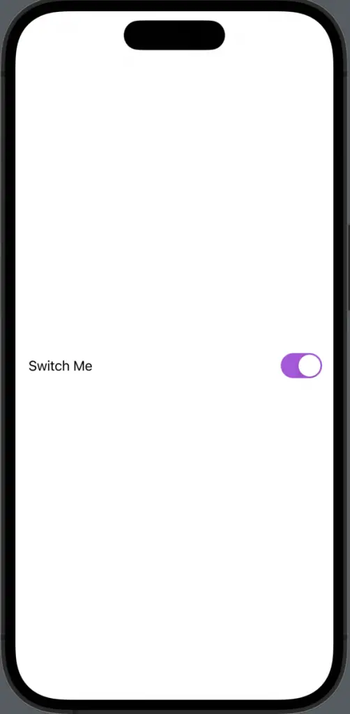
Toggle("Switch Me", isOn: $isOn)
.toggleStyle(SwitchToggleStyle(tint: .purple)).padding()
}
}You can customize the toggle using toggleStyle(). In this example, we changed the tint color to purple.
Toggle with Image
Code
import SwiftUI
struct ContentView: View {
@State private var isOn = true
var body: some View {
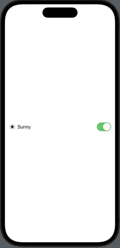
Toggle(isOn: $isOn) {
HStack {
Image(systemName: "sun.max.fill")
Text("Sunny")
}
}.padding()
}
}You can also use images along with text for toggle labels. We use an HStack to combine an image and text.
SwiftUI makes it easy to create and customize toggles. Whether you’re a beginner or an expert, you can make the most out of toggles in your apps with just a few lines of code.