How to Add Stepper in iOS SwiftUi
Are you new to SwiftUI or looking to understand how to use the Stepper component? You’ve come to the right place. In this blog post, we’ll dive into the world of SwiftUI Stepper. We’ll cover its basic usage, customization options, and practical examples.
What is a SwiftUI Stepper?
Stepper in SwiftUI is a UI element that lets users select a value from a range. It’s often used for settings like volume control or date selection. It’s a simple yet powerful tool to enhance your app’s user experience.
Basic Usage
To use a Stepper, you need to bind it to a state variable. Here’s a simple example:
import SwiftUI
struct ContentView: View {
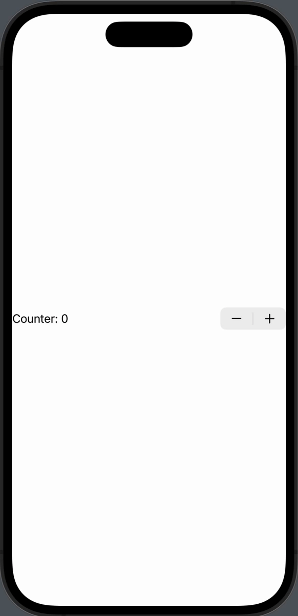
@State private var counter = 0
var body: some View {
Stepper("Counter: \(counter)", value: $counter)
}
}In this example, the Stepper is bound to a counter variable. When you tap the plus or minus, the counter changes.
Custom Range
You can set a custom range for your Stepper. Here’s how:
Stepper("Counter: \(counter)", value: $counter, in: 0...10)Now, the Stepper will only allow values between 0 and 10.
Step Size
You can also set a custom step size. Take a look:
Stepper("Counter: \(counter)", value: $counter, in: 0...10, step: 2)The counter will now increase or decrease by 2.
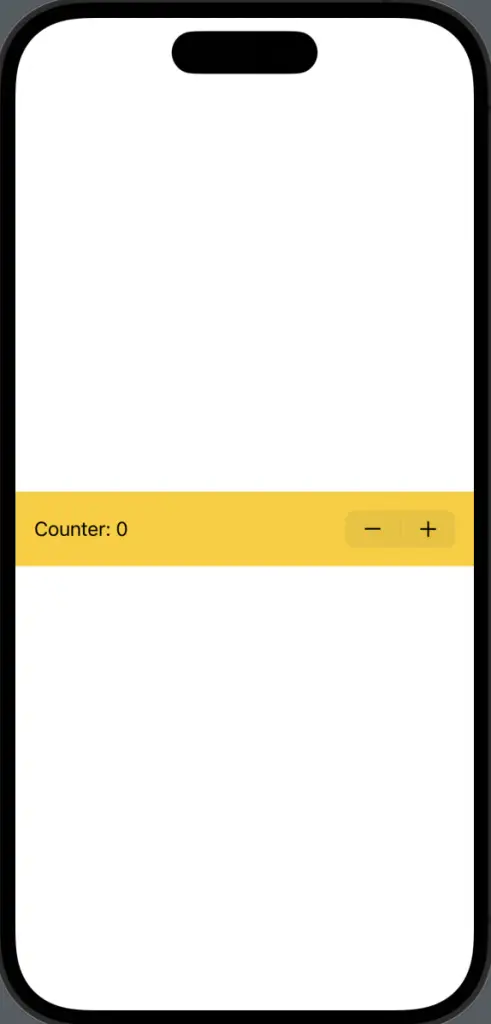
Customization
You can customize the Stepper’s appearance using modifiers. For example:
Stepper("Counter: \(counter)", value: $counter)
    .padding()
    .background(Color.yellow)
This adds padding and a yellow background to the Stepper.
SwiftUI Stepper is a versatile component that can be easily customized to fit your needs. Whether you’re building a simple counter or a dynamic list, Stepper has got you covered.

