How to Add Date Range Picker in Flutter
Date range pickers are an essential component in most modern apps that allows users to select a range of dates. With Flutter’s intuitive and flexible UI framework, you can easily create a date range picker that fits your app’s design and requirements.
In this blog post, let’s learn how to show a date range picker in Flutter. Similar to the date picker we have the showDateRangePicker function that helps us to show a modal dialog containing the Material Design date range picker.
The following function opens the date range picker.
showDateRangePicker(
                    context: context,
                    firstDate: DateTime(1900),
                    lastDate: DateTime(2100));
In this example, we are also using the intl flutter package so that we can show the dates picked by the user easily as text.
Following is the complete code to implement the date range picker in Flutter.
import 'package:flutter/material.dart';
import 'package:intl/intl.dart';

void main() => runApp(const MyApp());

class MyApp extends StatelessWidget {
  const MyApp({super.key});

  @override
  Widget build(BuildContext context) {
    return MaterialApp(
        title: 'Flutter Demo',
        theme: ThemeData(
          useMaterial3: true,
        ),
        home: const MyStatefulWidget());
  }
}

class MyStatefulWidget extends StatefulWidget {
  const MyStatefulWidget({super.key});

  @override
  State<MyStatefulWidget> createState() => _MyStatefulWidgetState();
}

class _MyStatefulWidgetState extends State<MyStatefulWidget> {
  final dateController = TextEditingController();

  @override
  void dispose() {
    // Clean up the controller when the widget is removed
    dateController.dispose();
    super.dispose();
  }

  @override
  Widget build(BuildContext context) {
    return Scaffold(
        appBar: AppBar(
          title: const Text('Flutter Date Range Picker Example'),
        ),
        body: Padding(
            padding: const EdgeInsets.all(16.0),
            child: Center(
                child: TextField(
              readOnly: true,
              controller: dateController,
              decoration:
                  const InputDecoration(hintText: 'Pick your Date Range'),
              onTap: () async {
                var dates = await showDateRangePicker(
                    context: context,
                    firstDate: DateTime(1900),
                    lastDate: DateTime(2100));
                if (dates != null) {
                  dateController.text =
                      '${DateFormat('MM/dd/yyyy').format(dates.start)} to ${DateFormat('MM/dd/yyyy').format(dates.end)}';
                }
              },
            ))));
  }
}
Here, the date range picker is opened when the user clicks on the TextField. After choosing the dates, TextField shows both dates using the intl package.
See the following output.
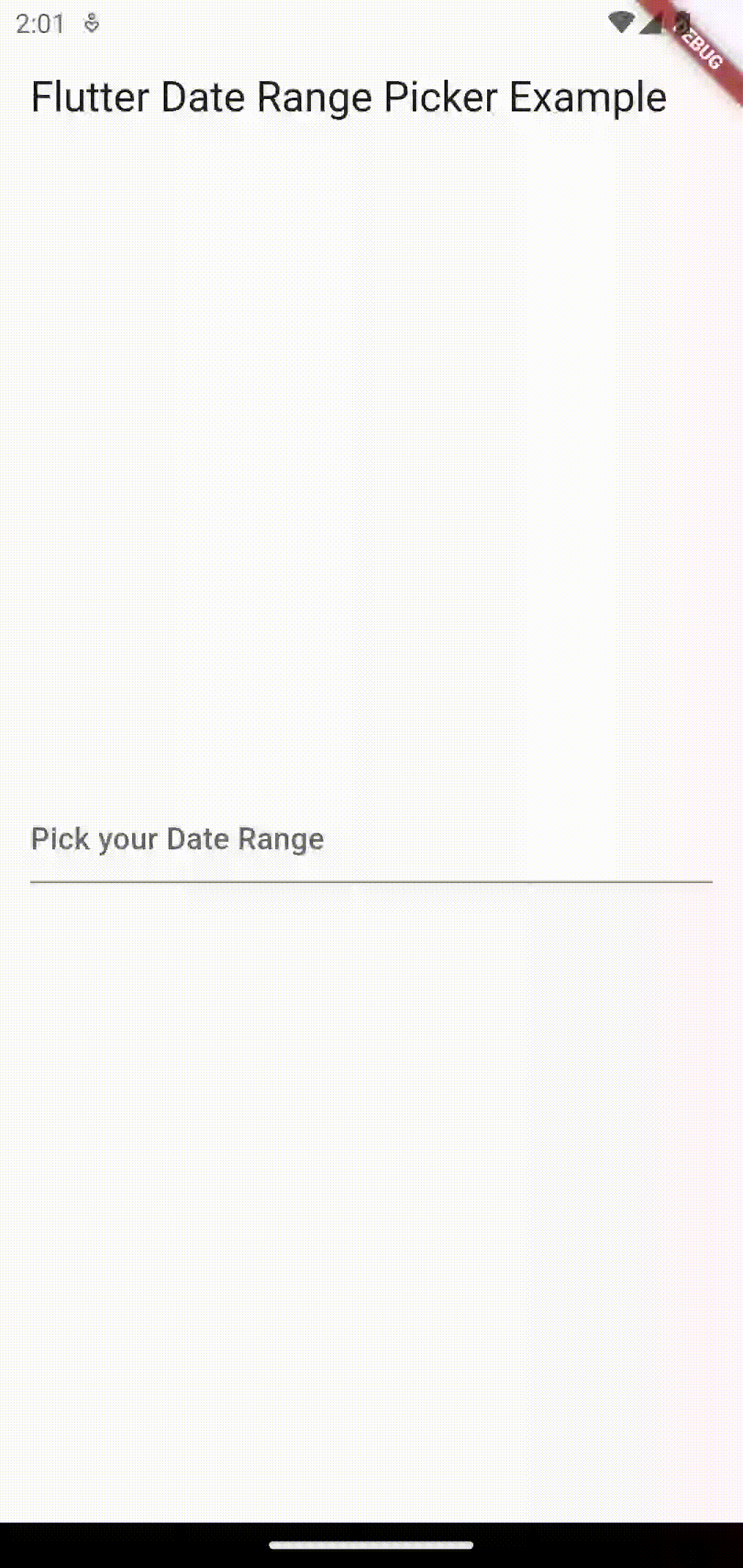
That’s how you add a simple date range picker in Flutter.