How to Add Border to Row in Android Jetpack Compose
Jetpack Compose, the modern toolkit for building native Android UI, provides a flexible, powerful, and intuitive way to create app interfaces declaratively. This blog post will show you how to add a border to a Row in Jetpack Compose.
Firstly, let’s understand what a Row is in Jetpack Compose. A Row places its children in a horizontal sequence. It’s similar to the LinearLayout with horizontal orientation in traditional Android views.
Let’s see how to add a border to it:
Row(
    modifier = Modifier.fillMaxWidth().padding(10.dp).
    border(2.dp, Color.Red, RoundedCornerShape(10.dp)),
    ) {
      Text("Coding with Rashid", Modifier.padding(16.dp))
      }
In the above code, the Modifier.border is used to draw a border around the Row. It takes three parameters:
- borderWidth: the width of the border.
- color: the color of the border.
- shape: the shape of the border.
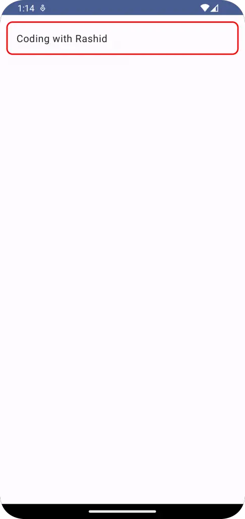
In our case, we have used RoundedCornerShape for rounded corners. By running the above code, you’ll see text surrounded by a red border with rounded corners.
Following is the complete code for reference.
package com.example.example

import android.os.Bundle
import androidx.activity.ComponentActivity
import androidx.activity.compose.setContent
import androidx.compose.foundation.border
import androidx.compose.foundation.layout.Column
import androidx.compose.foundation.layout.Row
import androidx.compose.foundation.layout.fillMaxSize
import androidx.compose.foundation.layout.fillMaxWidth
import androidx.compose.foundation.layout.padding
import androidx.compose.foundation.shape.RoundedCornerShape
import androidx.compose.material3.MaterialTheme
import androidx.compose.material3.Surface
import androidx.compose.material3.Text
import androidx.compose.runtime.Composable
import androidx.compose.ui.Modifier
import androidx.compose.ui.graphics.Color
import androidx.compose.ui.tooling.preview.Preview
import androidx.compose.ui.unit.dp
import com.example.example.ui.theme.ExampleTheme

class MainActivity : ComponentActivity() {
    override fun onCreate(savedInstanceState: Bundle?) {
        super.onCreate(savedInstanceState)
        setContent {
            ExampleTheme {
                // A surface container using the 'background' color from the theme
                Surface(
                    modifier = Modifier.fillMaxSize(),
                    color = MaterialTheme.colorScheme.background
                ) {
                    RowExample()
                }
            }
        }
    }
}

@Composable
fun RowExample() {
    Column {
        Row(
            modifier = Modifier.fillMaxWidth().padding(10.dp).
            border(2.dp, Color.Red, RoundedCornerShape(10.dp)),
        ) {
            Text("Coding with Rashid", Modifier.padding(16.dp))
        }
    }
}

@Preview(showBackground = true)
@Composable
fun ExamplePreview() {
    ExampleTheme {
        RowExample()
    }
}
Understanding these aspects of the Compose toolkit will allow you to build more sophisticated layouts and design more interactive UIs.