How to Use Icons in Android Jetpack Compose
In any mobile application, icons are fundamental to the user interface. They serve as visual cues that guide the user’s interaction with the app.
In this blog post, we’ll delve into how to work with icons in Android’s modern UI toolkit, Jetpack Compose. We’ll cover how to set an icon’s size and color, incorporate icons within buttons, and load icons from drawable resources.
How to Add an Icon in Jetpack Compose
In Jetpack Compose, the Icon composable is a convenient way to display a single color icon on the screen, following Material Design guidelines. It is part of the Compose Material library. If you’re working with Material 3, the library also supports this.
The Icon composable is by default tinted with LocalContentColor.current and is 24.dp in size. It also exposes a tint color parameter for customizing the icon color.
Icon(
    imageVector = Icons.Default.Home,
    contentDescription = "Home Icon"
)
How to Add an Icon from Drawable in Jetpack Compose
In addition to the built-in material design icons, you can also use your custom icons from the drawable resources. Here’s how you load an icon from the drawable.
Icon(
     painter = painterResource(R.drawable.home),
     contentDescription = "Home Icon"
)
How to Change Icon Size in Jetpack Compose
In Jetpack Compose, you can use the Modifier.size function to set the width, height, or both for an icon. Here’s an example of setting an icon size.
Icon(
    imageVector = Icons.Default.Home,
    contentDescription = "Home Icon",
    modifier = Modifier.size(48.dp)
)
Here, Modifier.size function sets both the width and height of the icon to 48 dp.
How to Change Icon Color in Jetpack Compose
In Jetpack Compose, you can modify an icon’s color with the tint parameter in the Icon composable. For instance, here’s how you change an icon’s color to red.
Icon(
    imageVector = Icons.Default.Home,
    contentDescription = "Home Icon",
    tint = Color.Red
)
How to Add Icon Button in Jetpack Compose
You can also use icons within buttons to make them more intuitive. In Jetpack Compose, place an Icon composable inside an IconButton to create a clickable icon. Here’s an example:
IconButton(onClick = { /* handle click */ }) {
    Icon(
        imageVector = Icons.Default.Home,
        contentDescription = "Home Icon"
    )
}
In this code snippet, IconButton provides a clickable area, and Icon delivers the icon’s visual representation.
Following is the complete code for displaying an icon in Jetpack Compose.
package com.example.example
import android.os.Bundle
import androidx.activity.ComponentActivity
import androidx.activity.compose.setContent
import androidx.compose.foundation.layout.Column
import androidx.compose.foundation.layout.fillMaxSize
import androidx.compose.foundation.layout.size
import androidx.compose.material.icons.Icons
import androidx.compose.material.icons.filled.Home
import androidx.compose.material3.Icon
import androidx.compose.material3.MaterialTheme
import androidx.compose.material3.Surface
import androidx.compose.runtime.Composable
import androidx.compose.ui.Modifier
import androidx.compose.ui.graphics.Color
import androidx.compose.ui.text.ExperimentalTextApi
import androidx.compose.ui.tooling.preview.Preview
import androidx.compose.ui.unit.dp
import com.example.example.ui.theme.ExampleTheme
class MainActivity : ComponentActivity() {
override fun onCreate(savedInstanceState: Bundle?) {
super.onCreate(savedInstanceState)
setContent {
ExampleTheme {
// A surface container using the 'background' color from the theme
Surface(
modifier = Modifier.fillMaxSize(),
color = MaterialTheme.colorScheme.background
) {
IconExample()
}
}
}
}
}
@OptIn(ExperimentalTextApi::class)
@Composable
fun IconExample() {
Column() {
Icon(
imageVector = Icons.Default.Home,
contentDescription = "Home Icon",
tint = Color.Red,
modifier = Modifier.size(72.dp)
)
}
}
@Preview(showBackground = true)
@Composable
fun ExamplePreview() {
ExampleTheme {
IconExample()
}
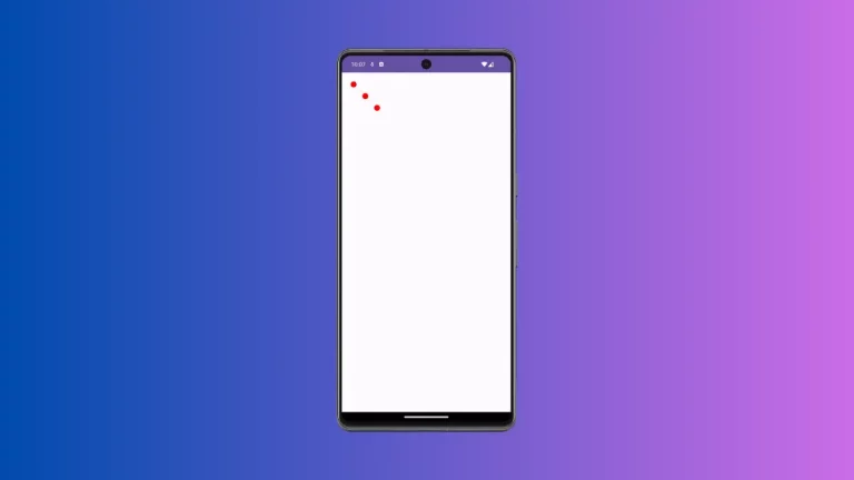
}And following is the output.
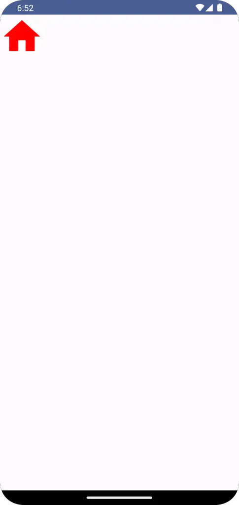
Icons significantly contribute to making your app intuitive and user-friendly. Jetpack Compose provides a streamlined, flexible way to work with icons, enabling you to easily adjust their size, change their color, incorporate them in buttons, and load them from drawable resources.