How to Change Slider Color in iOS SwiftUI
Sliders are indispensable components in modern user interfaces, allowing users to input and select values across a range. With SwiftUI, you can not only create sliders but also customize their appearance to align with your app’s design.
In this blog post, let’s check how to set custom colors for slider in SwiftUI.
Create a Slider with Custom Color
Let’s start with a practical example demonstrating how to create a slider with a custom color in SwiftUI:
import SwiftUI
struct ContentView: View {
@State private var sliderValue = 0.5
var body: some View {
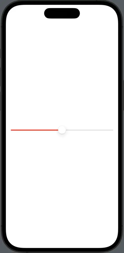
Slider(value: $sliderValue, in: 0...1)
.tint(.red)
.padding()
}
}Explore the Code
State Variable:
The sliderValue state variable holds the current value of the slider.
Slider Initialization:
We initialize a Slider with a value range of 0 to 1 and bind it to the sliderValue state variable.
Custom Color:
The .tint(.red) modifier sets the color of the slider’s track to red.
Padding:
Padding is added to ensure proper spacing and a visually pleasing layout.
Tips for Effective Slider Color Choices
Accessibility
Ensure that the chosen slider color offers sufficient contrast with the background to maintain accessibility for users with varying visual abilities.
Visual Hierarchy
Consider the context of the slider. If it represents a crucial setting or action, the color should differentiate it from other UI elements.
Customizing the color of sliders in SwiftUI is a valuable tool in your UI design arsenal. The provided example showcases how to easily implement custom slider colors.
By thoughtfully selecting colors that align with your app’s theme and adhering to accessibility guidelines, you can create sliders that enhance the user experience.