How to Add Slider in iOS SwiftUI
Sliders are widely used UI components that allow users to select a value or range within a predefined scale. In SwiftUI, creating and customizing sliders is incredibly straightforward. This blog post dives into how you can leverage SwiftUI to create sliders that are both functional and visually appealing.
Basic Slider in SwiftUI
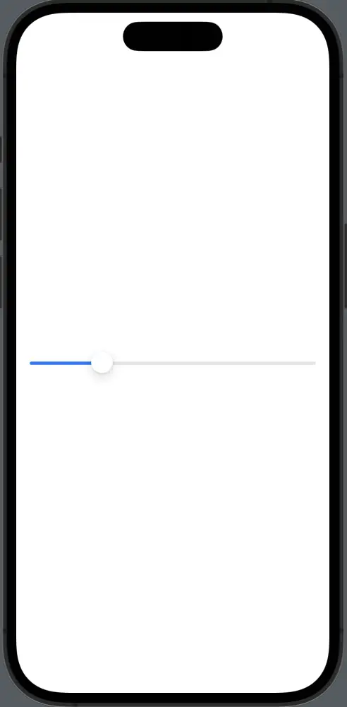
Here’s the simplest way to implement a slider in SwiftUI:
import SwiftUI

struct ContentView: View {
    @State private var sliderValue = 0.0

    var body: some View {
        Slider(value: $sliderValue, in: 0...100).padding()
    }
}
Breakdown of the Code
State Variable
The sliderValue state variable holds the current value of the slider.
Slider Initialization
The Slider view is initialized with a range of 0 to 100 and bound to the sliderValue state variable.
How to Get Slider Value
Retrieving the current value of the slider is crucial for performing actions based on user input. In SwiftUI, this can be achieved by using the onEditingChanged modifier.
import SwiftUI

struct ContentView: View {
    @State private var sliderValue = 0.0

    var body: some View {
        Slider(value: $sliderValue, in: 0...100, onEditingChanged: { editing in
            print(editing)
            print($sliderValue)
        }
        )
    }
}
Customize Slider Appearance
Adjust Colors
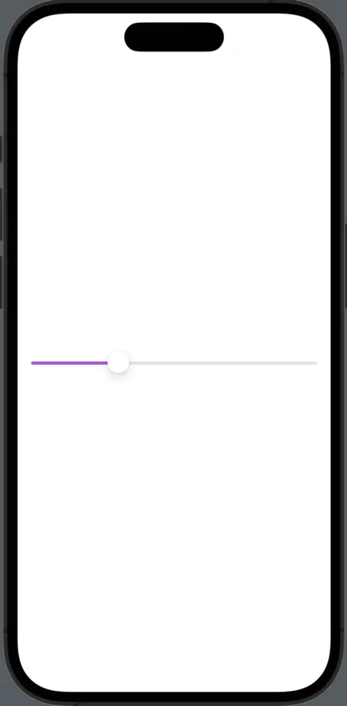
To set a custom color, use the .tint() modifier.
import SwiftUI

struct ContentView: View {
    @State private var sliderValue = 0.0

    var body: some View {
        Slider(value: $sliderValue, in: 0...100){
            Text("Volume")
        }.tint(.purple).padding()
    }
}
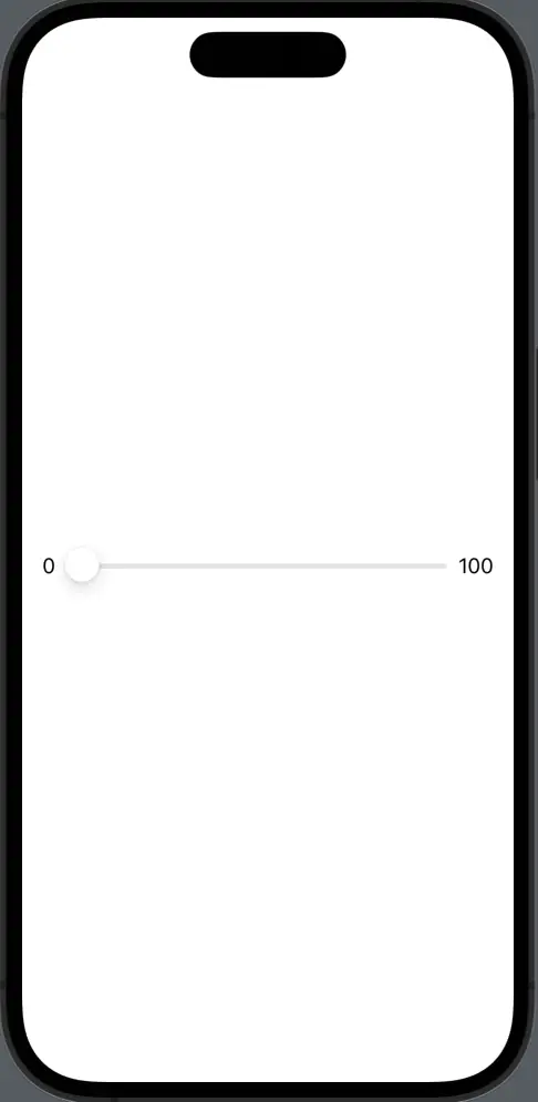
Add Minimum and Maximum Label
You can provide more context to the slider by adding labels indicating its minimum and maximum values.
import SwiftUI

struct ContentView: View {
    @State private var sliderValue = 0.0

    var body: some View {
        Slider(
            value: $sliderValue,
            in: 0...100
        ) {
            Text("Speed")
        } minimumValueLabel: {
            Text("0")
        } maximumValueLabel: {
            Text("100")
        }.padding()
    }
}
Tips for Effective Slider Usage
Fine-tune Value Range
Be specific about the range of acceptable values. For example, if it’s a volume control, using a range of 0 to 100 makes more sense than 0 to 1000.
Implement Step Increments
To make the slider move in specific steps, you can use the step parameter.
Slider(value: $sliderValue, in: 0...100, step: 5)Provide Instant Feedback
Consider providing real-time feedback as the user moves the slider. You can use labels, haptic feedback, or even audio cues.
The slider is a versatile and useful component in SwiftUI that can be customized in various ways to fit the needs of your app. From simply displaying a value range to creating intricate, highly customized sliders, SwiftUI provides the flexibility to do it all.
With the tips and tricks outlined in this blog post, you’ll be well on your way to mastering sliders in SwiftUI.