How to Manage LazyHGrid Spacing in iOS SwiftUI
Designing a visually pleasing and user-friendly app interface involves paying attention to the minor details, such as the spacing between grid elements. In this blog post, we’ll explore how to manage the spacing in SwiftUI’s LazyHGrid, focusing on both column and row spacing.
LazyHGrid Overview
In SwiftUI, LazyHGrid is a flexible and efficient container that arranges child views in a horizontally scrolling grid. While handling large datasets, it only renders views that are currently visible on screen, which optimizes performance.
Adjust Spacing in LazyHGrid
One of the key aspects of designing with LazyHGrid is managing the spacing between rows and columns. Let’s deep dive into how we can set the spacing between rows and columns in a LazyHGrid using practical examples.
Spacing Between Rows
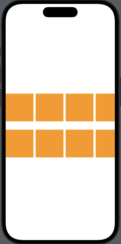
To manage row spacing in a LazyHGrid, we use the spacing parameter within the GridItem initializer. Here’s an example that demonstrates this:
struct ContentView: View {
    var body: some View {
        ScrollView(.horizontal) {
            LazyHGrid(rows: Array(repeating: .init(.fixed(100), spacing: 30), count: 2)) {
                ForEach(1...20, id: \.self) { _ in
                    Rectangle()
                        .fill(Color.orange)
                        .frame(width: 100, height: 100)
                }
            }
        }
    }
}
In this example, the LazyHGrid comprises two rows with a 30-point gap between them. Each cell in the grid is a 100×100 orange rectangle, with a 30-point gap separating the rows due to the spacing parameter in the GridItem initializer.
Spacing Between Columns
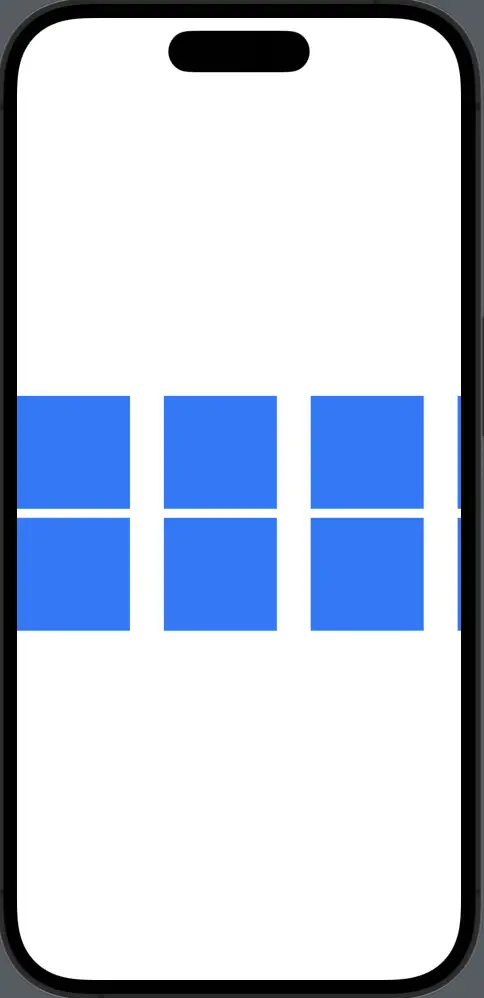
Next, let’s manage the spacing between columns in a LazyHGrid using the spacing parameter within the LazyHGrid initializer itself.
struct ContentView: View {
    var body: some View {
        ScrollView(.horizontal, showsIndicators: false) {
            LazyHGrid(rows: Array(repeating: .init(.fixed(100)), count: 2), spacing: 30) {
                ForEach(1...20, id: \.self) { _ in
                    Rectangle()
                        .fill(Color.blue)
                        .frame(width: 100, height: 100)
                }
            }
        }
    }
}
In this case, we’ve established a 30-point gap between each column. Our grid cells are 100×100 blue rectangles, and because of the spacing parameter in the LazyHGrid initializer, a 30-point gap separates the columns.
Remember, while aesthetics are important, so is usability. Tailor the amount of space between your rows and columns to your content and users’ needs. Use the right amount of spacing to make the content easy to interact with and pleasing to the eye.
Mastering the spacing in SwiftUI’s LazyHGrid helps you to create visually pleasing, user-friendly layouts. It provides a fine-grained control over the design of your app, allowing you to create stunning interfaces that meet your users’ needs.
