How to Customize LazyVGrid Column Width in iOS SwiftUI
Creating efficient and visually pleasing grid layouts in SwiftUI becomes intuitive with the LazyVGrid. But what about column widths? Can they be adjusted? Yes, indeed!
This comprehensive guide will help you learn how to customize column widths in SwiftUI’s LazyVGrid using flexible, fixed, and adaptive column types.
GridItem Overview
In SwiftUI, GridItem represents a single dimension in the layout of a grid. It can be fixed, flexible, or adaptive, each of which provides different characteristics:
fixed: Provides a specific size.flexible: Expands to occupy any extra available space.adaptive: Automatically adjusts the number of items based on the available space and the defined minimum size.
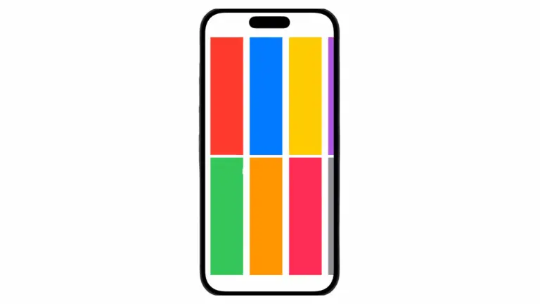
Flexible Columns
flexible GridItems can be used when you want your columns to share the available space. You can also specify different minimum and maximum values for each column.
struct ContentView: View {
    let columns = [
        GridItem(.flexible(minimum: 100, maximum: 200)),
        GridItem(.flexible(minimum: 50, maximum: 100))
    ]
    let colors: [Color] = [.red, .green, .blue, .orange, .yellow, .pink, .purple, .gray]
    var body: some View {
        ScrollView {
            LazyVGrid(columns: columns, spacing: 20) {
                ForEach(colors, id: \.self) { color in
                    Rectangle()
                        .fill(color)
                        .frame(height: 100)
                }
            }
            .padding(.horizontal)
        }
    }
}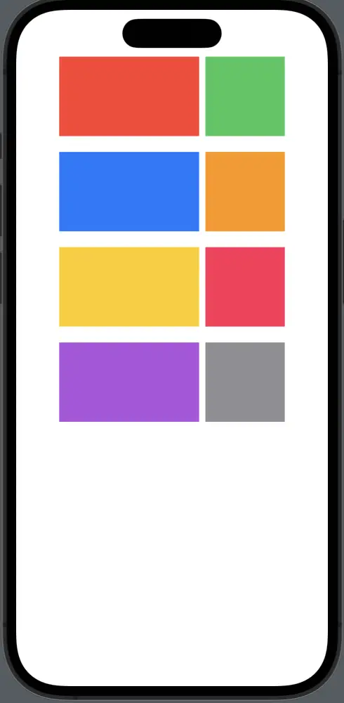
Fixed Columns
fixed GridItems are used when you want columns of a specific width that won’t change based on available space.
struct ContentView: View {
    let columns = [
        GridItem(.fixed(150)),
        GridItem(.fixed(100))
    ]
    let colors: [Color] = [.red, .green, .blue, .orange, .yellow, .pink, .purple, .gray]
    var body: some View {
        ScrollView {
            LazyVGrid(columns: columns, spacing: 20) {
                ForEach(colors, id: \.self) { color in
                    Rectangle()
                        .fill(color)
                        .frame(height: 100)
                }
            }
            .padding(.horizontal)
        }
    }
}
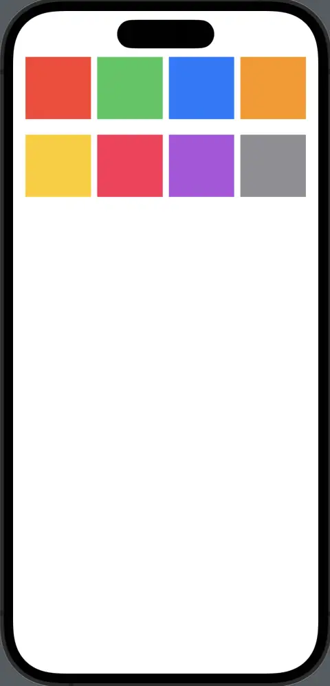
Adaptive Columns
adaptive GridItems automatically adjust the number of items based on the available space and the defined minimum size.
struct ContentView: View {
    let columns = [
        GridItem(.adaptive(minimum: 80))
    ]
    let colors: [Color] = [.red, .green, .blue, .orange, .yellow, .pink, .purple, .gray]
    var body: some View {
        ScrollView {
            LazyVGrid(columns: columns, spacing: 20) {
                ForEach(colors, id: \.self) { color in
                    Rectangle()
                        .fill(color)
                        .frame(height: 80)
                }
            }
            .padding(.horizontal)
        }
    }
}
SwiftUI’s LazyVGrid offers an intuitive and powerful way to create grids. With the proper understanding of GridItem and its attributes — fixed, flexible, and adaptive — you can tailor column widths as per your application’s design needs.