How to add Padding to TextButton in Flutter
TextButton is one of the most used buttons in Flutter. It helps to make text clickable and acts as a button. Even though default padding is enough for TextButton, sometimes you may want to customize padding.
Let’s check how to add padding to TextButton in Flutter.
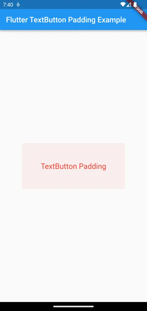
One way to style the TextButton is to use TextButton.styleFrom method. This method has a property named padding. You can make use of it apply padding around the button.
See the code snippet given below.
TextButton(
            style: TextButton.styleFrom(
                padding: const EdgeInsets.all(50),
                foregroundColor: Colors.red,
                textStyle: const TextStyle(fontSize: 20)),
            child: const Text('TextButton Padding'),
            onPressed: () {},
          ),
Here, the padding is uniform on all sides. See the output of TextButton when it is pressed.
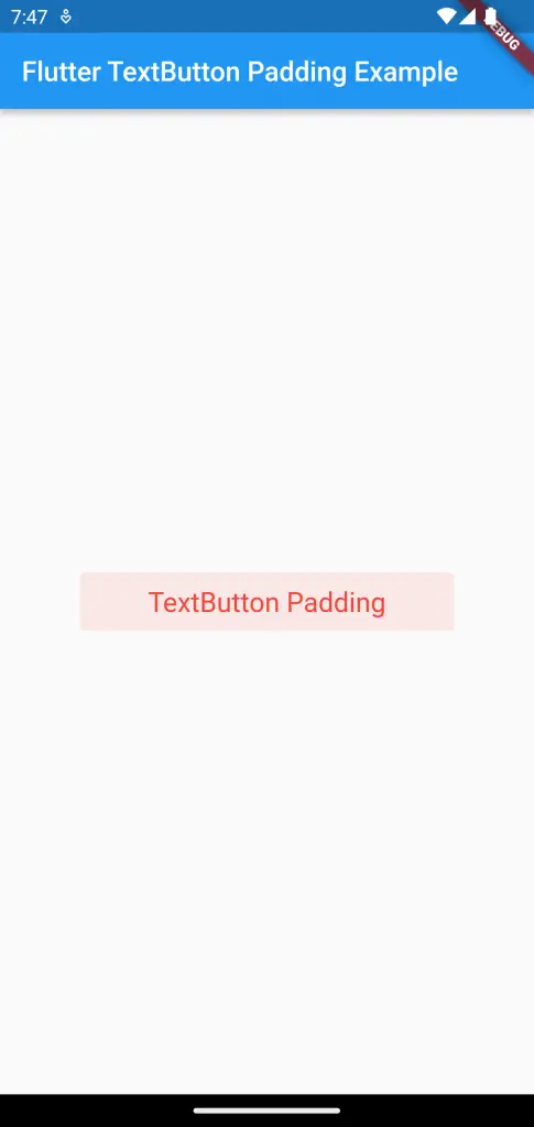
If you want to customize padding for different sides, use the following code snippet.
TextButton(
            style: TextButton.styleFrom(
                padding: const EdgeInsets.fromLTRB(50, 10, 50, 10),
                foregroundColor: Colors.red,
                textStyle: const TextStyle(fontSize: 20)),
            child: const Text('TextButton Padding'),
            onPressed: () {},
          ),
The padding is applied in left, top, right, and bottom order. See the output given below.
Following is the complete code for reference.
import 'package:flutter/material.dart';

void main() {
  runApp(const MyApp());
}

class MyApp extends StatelessWidget {
  const MyApp({super.key});

  // This widget is the root of your application.
  @override
  Widget build(BuildContext context) {
    return MaterialApp(
      title: 'Flutter Demo',
      theme: ThemeData(
        primarySwatch: Colors.blue,
      ),
      home: const MyHomePage(),
    );
  }
}

class MyHomePage extends StatelessWidget {
  const MyHomePage({super.key});

  @override
  Widget build(BuildContext context) {
    return Scaffold(
        appBar: AppBar(
          title: const Text(
            'Flutter TextButton Padding Example',
          ),
        ),
        body: Center(
          child: TextButton(
            style: TextButton.styleFrom(
                padding: const EdgeInsets.fromLTRB(50, 10, 50, 10),
                foregroundColor: Colors.red,
                textStyle: const TextStyle(fontSize: 20)),
            child: const Text('TextButton Padding'),
            onPressed: () {},
          ),
        ));
  }
}
I hope this Flutter TextButton padding tutorial is helpful for you.