How to Add Button in iOS SwiftUI
In this blog post, we will unpack one of the cornerstones of user interaction in any mobile application: the button. SwiftUI has revamped the way we create and work with buttons, making it faster and more intuitive than ever before.
Whether you’re coding a call-to-action, a navigation link, or a toggle, SwiftUI’s button struct forms the basis of these user interactions.
Basics: Create a Button
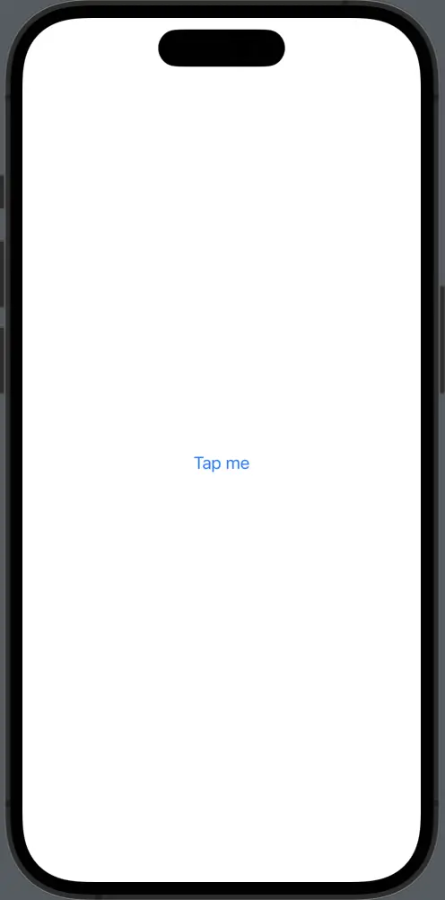
The SwiftUI Button struct comes with a very straightforward initializer. It requires two parameters: an action and a label. The action parameter is a closure that runs when the user taps the button. The label parameter is a closure that returns the view to display:
Button(action: {
    print("Button tapped!")
}) {
    Text("Tap me")
}
In this example, when the button is tapped, “Button tapped!” is printed to the console. The button displays a text view that reads “Tap me”.
Style a Button
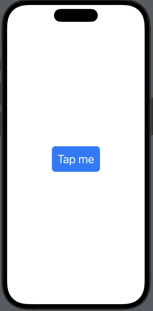
Buttons in SwiftUI can be styled in many ways. You can use modifiers on the label to change the appearance:
Button(action: {
    print("Button tapped!")
}) {
    Text("Tap me")
        .font(.largeTitle)
        .foregroundColor(.white)
        .padding()
        .background(Color.blue)
        .cornerRadius(10)
}
In this snippet, the button label has been styled with a large font, white text color, padding, a blue background, and rounded corners.
Button with Images
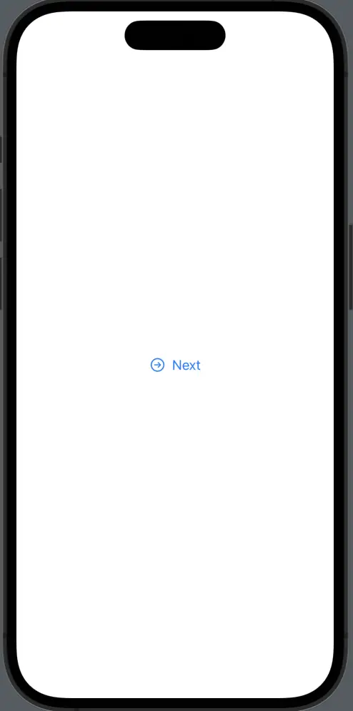
In SwiftUI, you can use an image as a button’s label. You can even combine an image with text:
Button(action: {
    print("Button tapped!")
}) {
    HStack {
        Image(systemName: "arrow.right.circle")
        Text("Next")
    }
}
Here, the button displays an arrow icon alongside the text “Next”.
Custom Button Styles
SwiftUI also allows you to create custom button styles by conforming to the ButtonStyle protocol. This enables you to design consistent and reusable styles across your app:
struct CustomButtonStyle: ButtonStyle {
func makeBody(configuration: Configuration) -> some View {
configuration.label
.padding(30)
.background(configuration.isPressed ? Color.gray : Color.blue)
.foregroundColor(.white)
.clipShape(Circle())
}
}
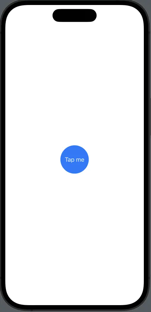
Button(action: {
print("Button tapped!")
}) {
Text("Tap me")
}.buttonStyle(CustomButtonStyle())This custom button style makes the button circular, changes the background color when pressed, and applies padding.
SwiftUI’s Button struct opens the door to creating engaging and intuitive user interfaces. By understanding how to implement, style, and customize buttons, you’ll be well-equipped to navigate the landscape of user interactions in SwiftUI.