A Guide to Different Button Styles in iOS SwiftUI
In this blog post, we delve into one of the integral aspects of SwiftUI – button styles. Specifically, we will discuss the five predefined button styles that SwiftUI provides and how to implement them. Additionally, we’ll go over how to create your own custom styles for that unique touch in your applications.
Predefined Styles
SwiftUI provides five predefined button styles that can be instantly applied to your buttons. These styles give you the convenience of implementing professionally-designed aesthetics without requiring you to build them from scratch.
Here are the five predefined styles:
1. AutomaticButtonStyle
This is the default style that SwiftUI uses when you don’t specify any other style. It adjusts the button’s appearance according to the context it is used in.
2. PlainButtonStyle
PlainButtonStyle gives your button a minimalist look without any additional styling. This style is ideal when you want the button to blend seamlessly with its surroundings.
Button(action: {
    print("Button tapped!")
}) {
    Text("Tap me")
}.buttonStyle(.plain)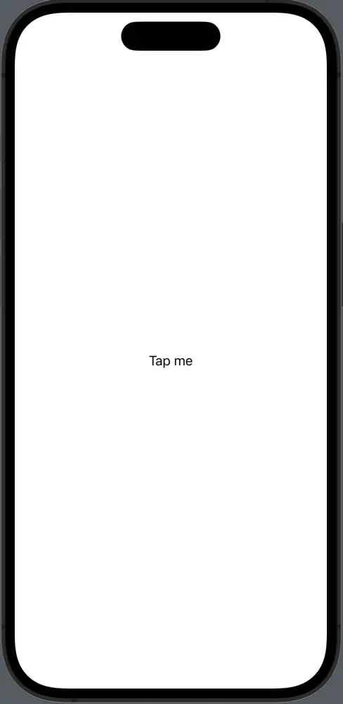
3. BorderlessButtonStyle
BorderlessButtonStyle makes the button appear without a border. This style works best when you want the button to blend into the background.
Button(action: {
    print("Button tapped!")
}) {
    Text("Tap me")
}.buttonStyle(.borderless)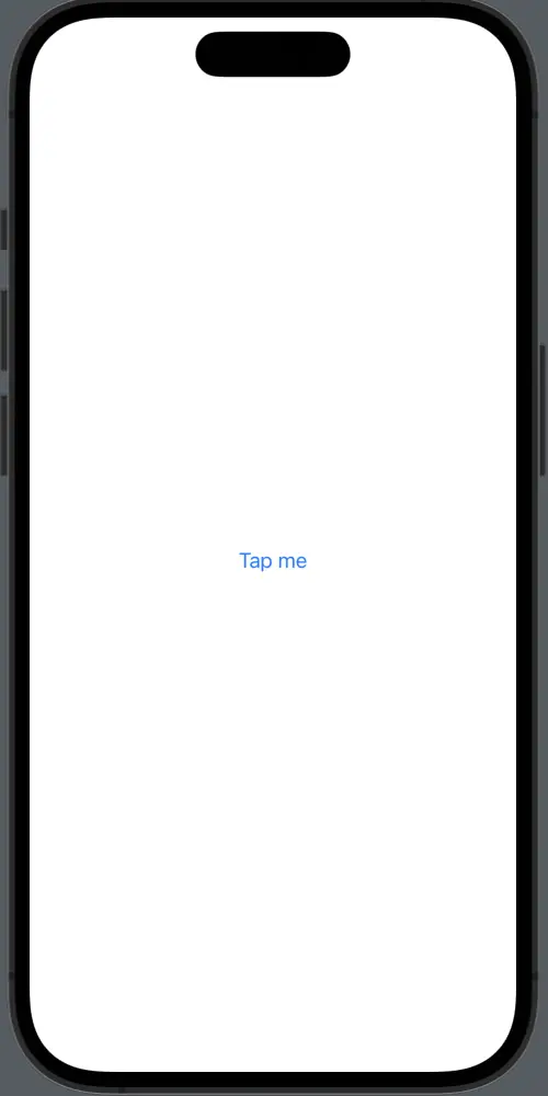
4. BorderedButtonStyle
BorderedButtonStyle provides your button with a border, giving it a distinct and eye-catching appearance.
Button(action: {
    print("Button tapped!")
}) {
    Text("Tap me")
}.buttonStyle(.bordered)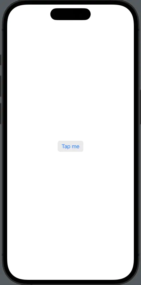
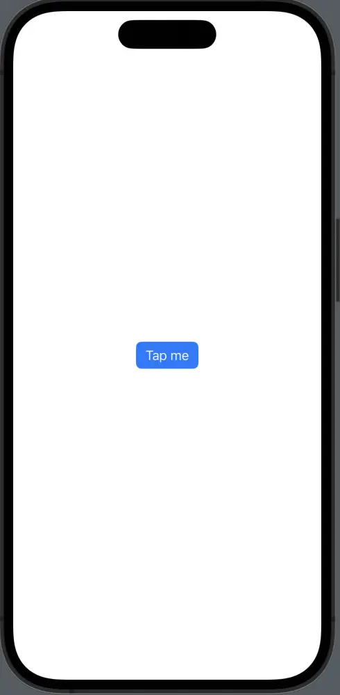
5. BorderedProminentButtonStyle
BorderedProminentButtonStyle not only gives a border to your button, but it also increases the prominence of the button, drawing more attention to it.
Each of these predefined styles offers a unique look and feel, allowing you to pick the one that best fits your particular requirements.
Custom Styles
Apart from the predefined styles, SwiftUI also allows you to create your own custom button styles. This is particularly useful when you need a unique style that matches your app’s specific design requirements.
To define your own style, you create a struct that conforms to the ButtonStyle protocol. This protocol requires you to implement a single method, makeBody(configuration:), where you define the appearance of the button.
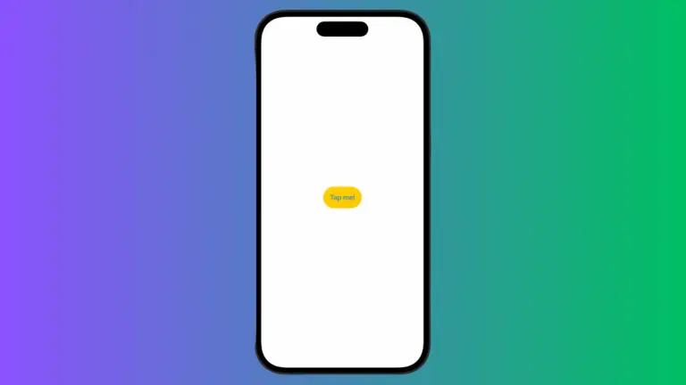
struct MyButtonStyle: ButtonStyle {
    func makeBody(configuration: Configuration) -> some View {
        configuration.label
            .padding()
            .background(Color.blue)
            .foregroundColor(.white)
            .clipShape(Circle())
    }
}
You can then apply your custom button style with the .buttonStyle() modifier:
Button(action: {
    // Button was tapped
}) {
    Text("Tap me!")
}.buttonStyle(MyButtonStyle())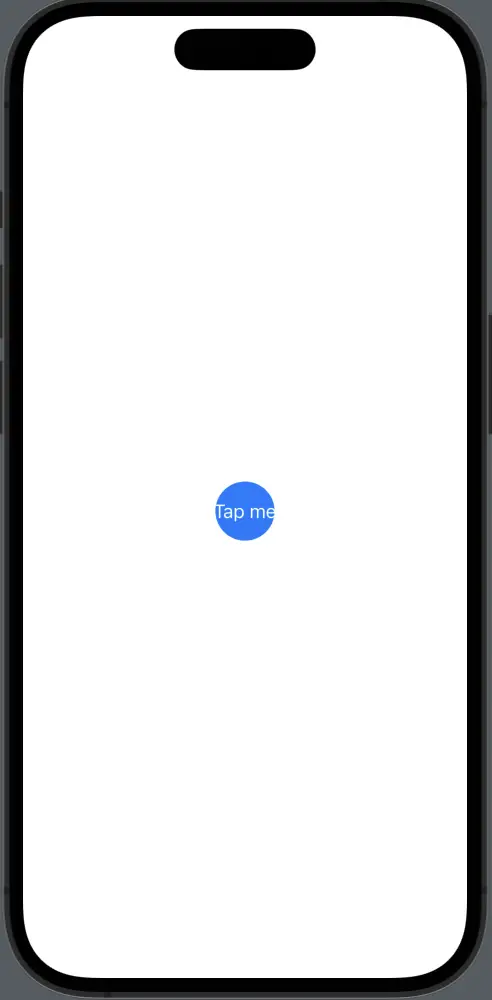
Button styling in SwiftUI offers a diverse array of options to enhance the aesthetics of your applications. Whether you’re using SwiftUI’s predefined styles for their ready-made elegance, or crafting your own styles to meet unique design requirements, you can create visually appealing and interactive user interfaces with ease.