How to create Simple Card in Flutter
A card is one of the popular components of material design. It’s simply a panel with slightly rounded corners and elevation. In this blog post, let’s learn how to add a basic card in Flutter.
The Card widget in Flutter helps you to create a basic card layout. Then it’s up to you to add other widgets as its child.
See the code snippet given below.
Card(
        child: Column(
          mainAxisSize: MainAxisSize.min,
          children: <Widget>[
            const ListTile(
              leading: Icon(
                Icons.abc,
                size: 50,
              ),
              title: Text('Demo Title'),
              subtitle: Text('This is a simple card in Flutter.'),
            ),
            TextButton(
              child: const Text('GOT IT'),
              onPressed: () {},
            ),
          ],
        ),
      ),
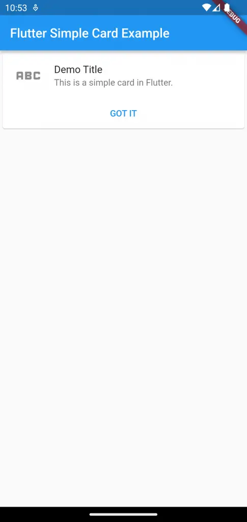
Here, I used the Column widget, ListTile widget, and TextButton widget as the child of the Card to create a simple neatly looking card.
The output is given below.

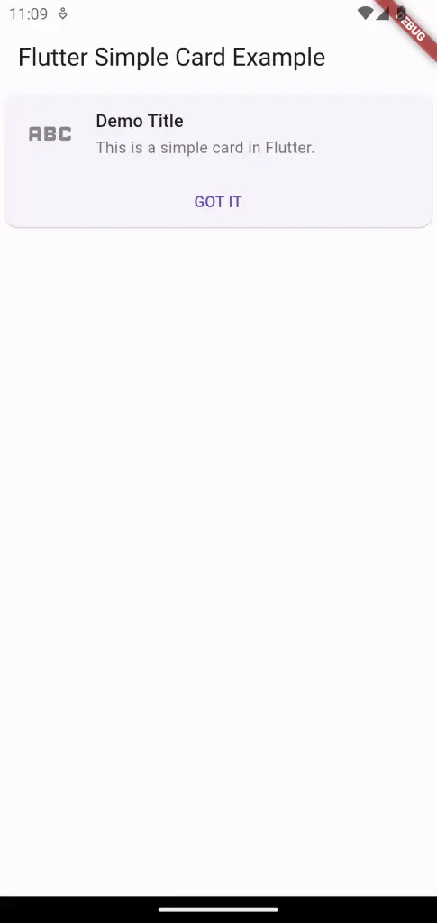
If you are using Material3 then you will get the following output.

Following is the complete code.
import 'package:flutter/material.dart';

void main() {
  runApp(const MyApp());
}

class MyApp extends StatelessWidget {
  const MyApp({super.key});

  // This widget is the root of your application.
  @override
  Widget build(BuildContext context) {
    return MaterialApp(
      title: 'Flutter Demo',
      theme: ThemeData(
        colorSchemeSeed: const Color(0xff6750a4),
        useMaterial3: true,
      ),
      home: const MyHomePage(),
    );
  }
}

class MyHomePage extends StatelessWidget {
  const MyHomePage({super.key});

  @override
  Widget build(BuildContext context) {
    return Scaffold(
      appBar: AppBar(
        title: const Text('Flutter Simple Card Example'),
      ),
      body: Card(
        child: Column(
          mainAxisSize: MainAxisSize.min,
          children: <Widget>[
            const ListTile(
              leading: Icon(
                Icons.abc,
                size: 50,
              ),
              title: Text('Demo Title'),
              subtitle: Text('This is a simple card in Flutter.'),
            ),
            TextButton(
              child: const Text('GOT IT'),
              onPressed: () {},
            ),
          ],
        ),
      ),
    );
  }
}
That’s how you add a simple card in Flutter.

