How to Create a Gradient Button in Flutter
Buttons are important components of the mobile app user interface. Users always interact with buttons of a mobile app to trigger various actions. Because of these reasons, making a button beautiful and appealing has its own significance in mobile app development.
In some design scenarios, making a button with gradient colors will be much better than plain color buttons. So, how do you create a button with gradient colors in Flutter?
Let’s use the ElevatedButton widget from the material design. We will decorate the elevated button with gradient colors. We use LinearGradient class for this purpose. The LinearGradient class is used by BoxDecoration class.
If you want to know how to add a button in flutter then check out this blog post.
See the following code snippet.
ElevatedButton(
                onPressed: () {},
                style: ElevatedButton.styleFrom(
                    padding: const EdgeInsets.all(0),
                    shape: RoundedRectangleBorder(
                        borderRadius: BorderRadius.circular(10))),
                child: Ink(
                    decoration: BoxDecoration(
                        gradient: const LinearGradient(
                            colors: [Colors.cyan, Colors.green]),
                        borderRadius: BorderRadius.circular(10)),
                    child: Container(
                        width: 120,
                        height: 40,
                        alignment: Alignment.center,
                        child: const Text(
                          'Gradient Button',
                        ))))
We added Ink as child of the ElevatedButton. Then the container is made the child of Ink widget.
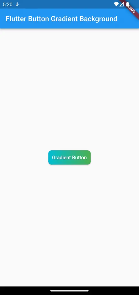
You will get the following output.
Following is the complete code.
import 'package:flutter/material.dart';

void main() {
  runApp(const MyApp());
}

class MyApp extends StatelessWidget {
  const MyApp({super.key});

  // This widget is the root of your application.
  @override
  Widget build(BuildContext context) {
    return MaterialApp(
      title: 'Flutter Demo',
      theme: ThemeData(
        primarySwatch: Colors.blue,
      ),
      home: const MyHomePage(),
    );
  }
}

class MyHomePage extends StatelessWidget {
  const MyHomePage({super.key});

  @override
  Widget build(BuildContext context) {
    return Scaffold(
        appBar: AppBar(
          title: const Text('Flutter Button Gradient Background'),
        ),
        body: Center(
            child: ElevatedButton(
                onPressed: () {},
                style: ElevatedButton.styleFrom(
                    padding: const EdgeInsets.all(0),
                    shape: RoundedRectangleBorder(
                        borderRadius: BorderRadius.circular(10))),
                child: Ink(
                    decoration: BoxDecoration(
                        gradient: const LinearGradient(
                            colors: [Colors.cyan, Colors.green]),
                        borderRadius: BorderRadius.circular(10)),
                    child: Container(
                        width: 120,
                        height: 40,
                        alignment: Alignment.center,
                        child: const Text(
                          'Gradient Button',
                        ))))));
  }
}
That’s how you add a button with gradient background in Flutter.