How to change Card Border Radius in Flutter
The Card widget helps to create a card-like template to accommodate other widgets. In this blog post, let’s learn how to set border radius for a Card in Flutter.
Even though the Card comes with a default border radius, you may want to tweak it for further customization. You can do it by making use of Card’s shape property.
See the code snippet given below.
Card(
        margin: const EdgeInsets.all(20),
        shape: RoundedRectangleBorder(
          borderRadius: BorderRadius.circular(20),
        ),
        color: Colors.yellow[100],
        child: Column(
          mainAxisSize: MainAxisSize.min,
          children: const <Widget>[
            ListTile(
              title: Text('Demo Title'),
              subtitle: Text('This is a simple card in Flutter.'),
            ),
          ],
        ),
      ),
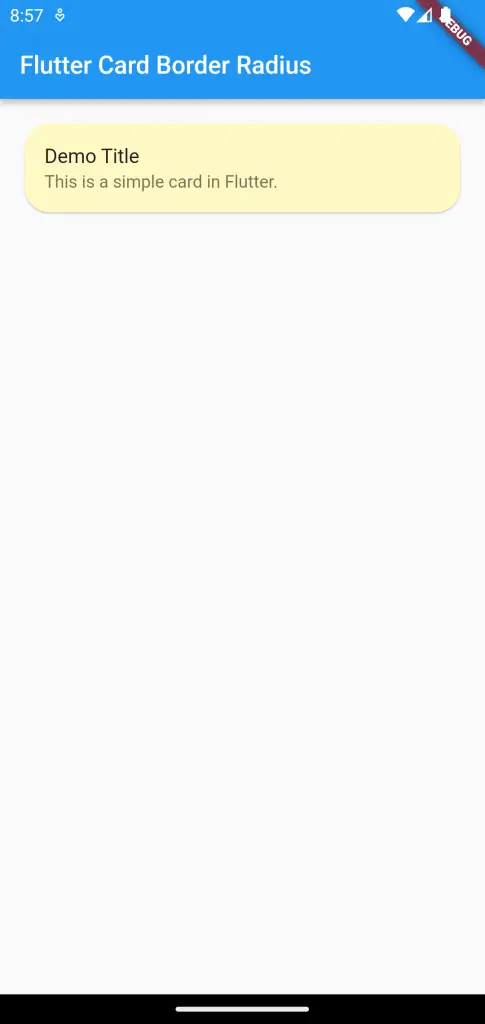
As you see, we used the RoundedRectangleBorder shape to give a custom border radius to the Card.
The output is given below.

Following is the complete code for reference.
import 'package:flutter/material.dart';

void main() {
  runApp(const MyApp());
}

class MyApp extends StatelessWidget {
  const MyApp({super.key});

  // This widget is the root of your application.
  @override
  Widget build(BuildContext context) {
    return MaterialApp(
      title: 'Flutter Demo',
      theme: ThemeData(
        primarySwatch: Colors.blue,
        // colorSchemeSeed: const Color(0xff6750a4),
        // useMaterial3: true,
      ),
      home: const MyHomePage(),
    );
  }
}

class MyHomePage extends StatelessWidget {
  const MyHomePage({super.key});

  @override
  Widget build(BuildContext context) {
    return Scaffold(
      appBar: AppBar(
        title: const Text('Flutter Card Border Radius'),
      ),
      body: Card(
        margin: const EdgeInsets.all(20),
        shape: RoundedRectangleBorder(
          borderRadius: BorderRadius.circular(20),
        ),
        color: Colors.yellow[100],
        child: Column(
          mainAxisSize: MainAxisSize.min,
          children: const <Widget>[
            ListTile(
              title: Text('Demo Title'),
              subtitle: Text('This is a simple card in Flutter.'),
            ),
          ],
        ),
      ),
    );
  }
}
That’s how you change border radius of the Card widget in Flutter.
You may also check out How to add borders to card in Flutter.

