How to Show Circular Progress Indicator in Flutter
A progress indicator is really helpful as it lets the user some processes are ongoing inside the mobile app. Here, in this blog post, let’s check how to show an indeterminate circular progress indicator in your Flutter app.
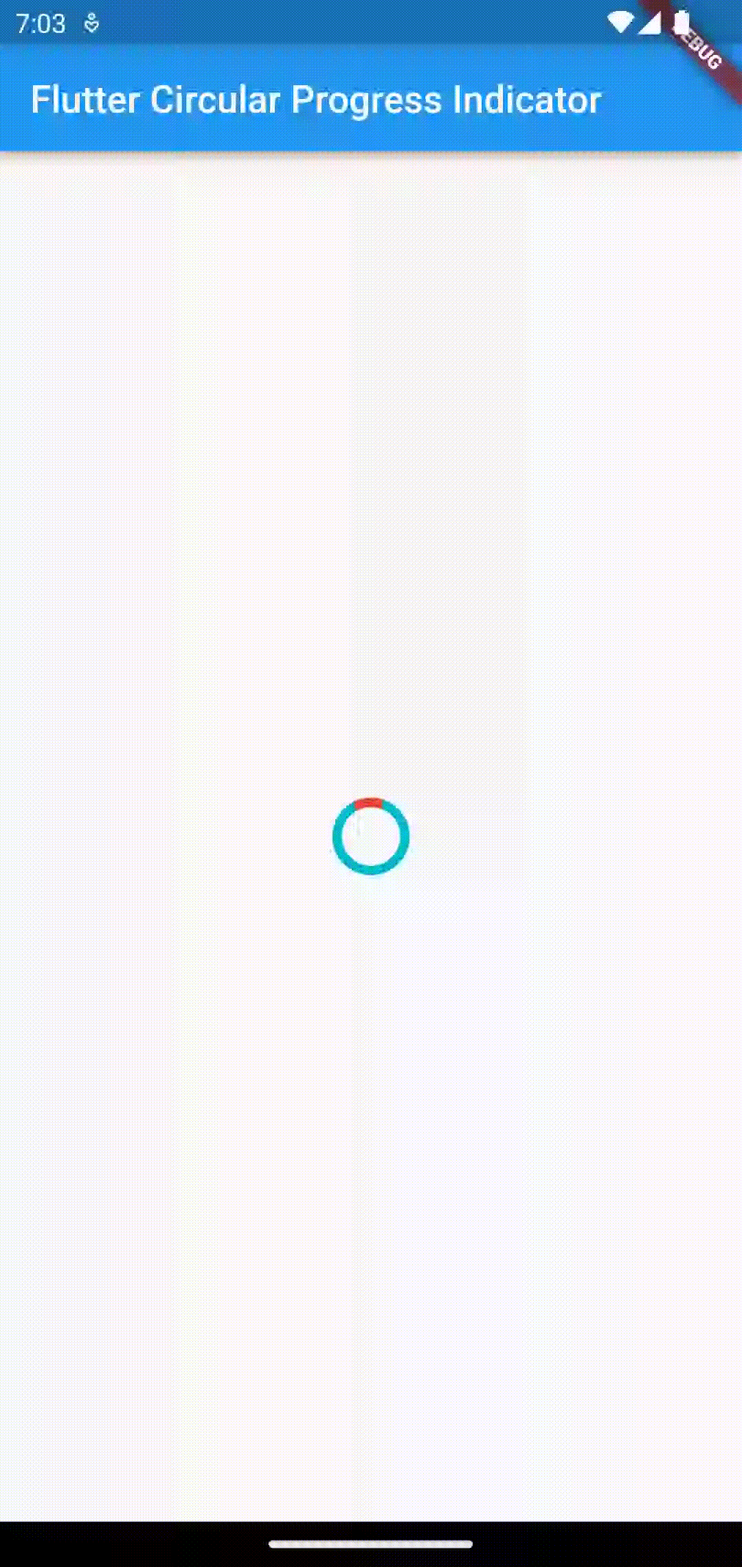
The CircularProgressIndicator widget helps to create circular progress indicators easily in Flutter. See the code snippet given below.
CircularProgressIndicator(
          backgroundColor: Colors.cyan,
          color: Colors.red,
          strokeWidth: 5,
        )
Here, I am showing an indeterminant circular progress indicator with red color as well as a stroke width of 5. The background color of the indicator is cyan. See the following output.
Following is the complete code.
import 'package:flutter/material.dart';

void main() {
  runApp(const MyApp());
}

class MyApp extends StatelessWidget {
  const MyApp({super.key});

  // This widget is the root of your application.
  @override
  Widget build(BuildContext context) {
    return MaterialApp(
      title: 'Flutter Demo',
      theme: ThemeData(
        primarySwatch: Colors.blue,
      ),
      home: const MyHomePage(),
    );
  }
}

class MyHomePage extends StatelessWidget {
  const MyHomePage({super.key});

  @override
  Widget build(BuildContext context) {
    return Scaffold(
        appBar: AppBar(
          title: const Text('Flutter Circular Progress Indicator'),
        ),
        body: const Center(
            child: CircularProgressIndicator(
          backgroundColor: Colors.cyan,
          color: Colors.red,
          strokeWidth: 5,
        )));
  }
}
Similarly, you can also add a linear progress indicator using the LinearProgressIndicator widget.