Different ProgressView Styles in iOS SwiftUI
Progress indicators are essential in modern apps to inform users about ongoing tasks, such as file downloads or data processing. SwiftUI offers a ProgressView element for this purpose, and it comes with various styles to fit different scenarios.
In this blog post, we’ll explore different ProgressView styles in iOS SwiftUI, including Automatic, Linear, and Circular styles.
What is a ProgressView?
A ProgressView in SwiftUI is a UI element that displays the progress of an ongoing task. It can be either determinate, showing a specific percentage of completion, or indeterminate, displaying a general waiting indicator.
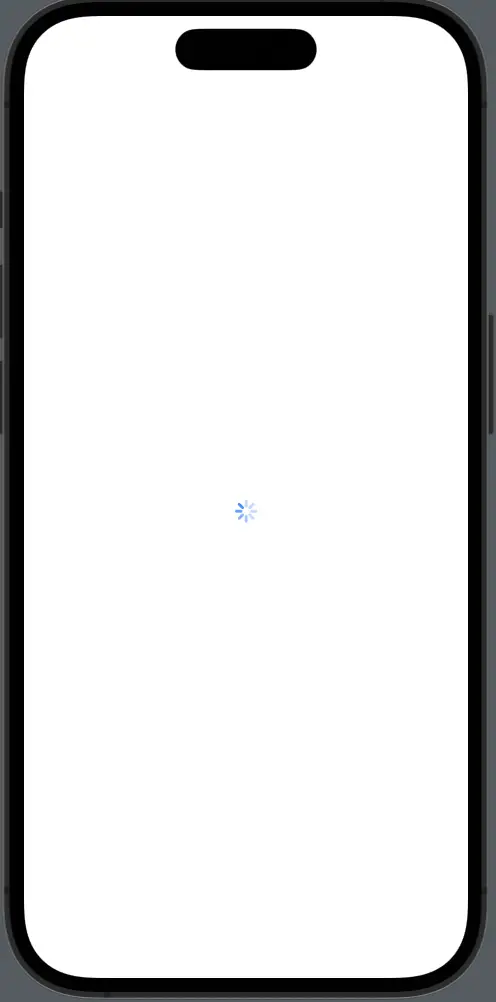
Automatic Style
Example: Default ProgressView
The default style is the Automatic style, which adapts to the platform and context where it’s used.
ProgressView("Loading...")Explanation: This is an indeterminate ProgressView with an automatic style. It adapts to the platform and the context in which it’s used, making it a versatile choice.
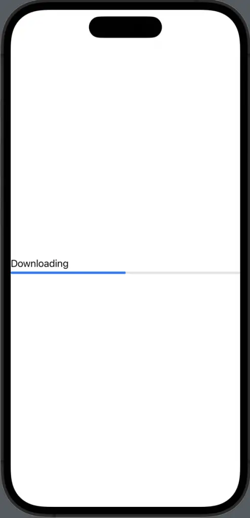
Linear Style
Example: Linear ProgressView
The Linear style displays progress in a horizontal bar.
ProgressView("Downloading", value: 0.5, total: 1)
    .progressViewStyle(.linear)
This is a determinate ProgressView that shows 50% completion. The LinearProgressViewStyle makes the progress bar horizontal.
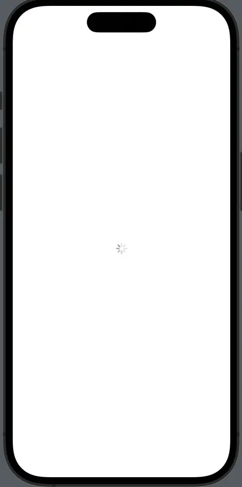
Circular Style
Example: Circular ProgressView
The Circular style shows progress in a circular form, which is often used for indeterminate tasks.
ProgressView()
    .progressViewStyle(.circular)
This is an indeterminate ProgressView with a circular style. It’s suitable for tasks where the completion percentage is unknown.
Customize Circular Style
You can also customize the Circular style, for example, by changing its tint color.
ProgressView()
    .progressViewStyle(CircularProgressViewStyle(tint: .blue))
Here, the circular ProgressView is customized with a blue tint, making it more aligned with the app’s theme.
Choose the Right Style
Context Matters
The style you choose should align with the context in which the ProgressView is used. For example, use Linear for file downloads and Circular for indeterminate tasks like data processing.
Platform Guidelines
Always consider platform guidelines and best practices to ensure a consistent and intuitive user experience.
SwiftUI provides various styles for ProgressView, making it a versatile element for displaying task progress. Whether you need a linear bar to show download progress or a circular indicator for an indeterminate task, SwiftUI has got you covered.