How to Position Children at Top and Bottom in Flutter Row
In Flutter, aligning elements within a Row isn’t limited to the horizontal axis. Sometimes, your design may call for a widget to be aligned to the top or bottom within a Row with a specified height.
Here, we’ll discuss how to align children vertically within a Row by providing it with a predefined height and width, along with code examples for clear understanding.
Vertical Alignment in a Row
To control the vertical alignment of widgets inside a Row, we utilize the crossAxisAlignment property. This property decides how children are placed along the vertical axis (the cross axis for a Row).
To visually see the alignment, we must first define a Row with a specific height. This is accomplished by wrapping the Row in a Container or a SizedBox with predefined width and height.
Align Child to Top of a Row
Here’s how you can align a child widget to the top of a Row that has a predefined height:
Container(
  width: double.infinity, // Taking the full width of the screen
  height: 100.0, // Predefined height for the Row
  color: Colors.grey[300], // Background color for visual reference
  child: Row(
    crossAxisAlignment: CrossAxisAlignment.start, // Aligns children to the top
    children: <Widget>[
      Container(
        color: Colors.blue,
        child: const Text('Top Aligned'),
      ),
      // Other children...
    ],
  ),
)
In this code, the Row is given a height of 100.0 pixels, and its children will be aligned to the top edge of this container.

Align Child to Bottom of a Row
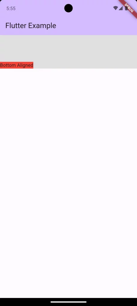
Similarly, if you want to align a child widget to the bottom of a Row, you would set crossAxisAlignment to CrossAxisAlignment.end:
Container(
  width: double.infinity,
  height: 100.0,
  color: Colors.grey[300],
  child: Row(
    crossAxisAlignment: CrossAxisAlignment.end, // Aligns children to the bottom
    children: <Widget>[
      Container(
        color: Colors.red,
        child: const Text('Bottom Aligned'),
      ),
      // Other children...
    ],
  ),
)
With CrossAxisAlignment.end, the Text widget is now aligned to the bottom of the Row.

Multiple Children Aligned at Top and Bottom
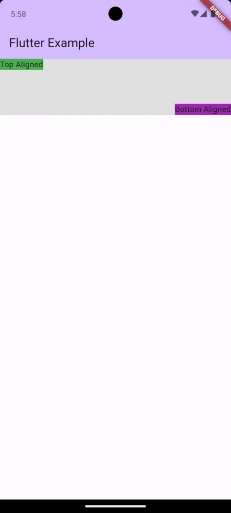
To illustrate multiple children within a Row with some aligned at the top and others at the bottom, we need to use the Align widget to override the crossAxisAlignment for individual children:
Container(
  width: double.infinity,
  height: 100.0,
  color: Colors.grey[300],
  child: Row(
    children: <Widget>[
      Align(
        alignment: Alignment.topLeft,
        child: Container(
          color: Colors.green,
          child: Text('Top Aligned'),
        ),
      ),
      Spacer(), // This will space out the children to the opposite ends
      Align(
        alignment: Alignment.bottomRight,
        child: Container(
          color: Colors.purple,
          child: Text('Bottom Aligned'),
        ),
      ),
    ],
  ),
)
Here, Spacer is used to push the children to the start and end of the Row, while Align widgets are used to align each child to the top and bottom of the container, respectively.

Following is the complete code for reference.
import 'package:flutter/material.dart';

void main() {
  runApp(const MyApp());
}

class MyApp extends StatelessWidget {
  const MyApp({super.key});

  @override
  Widget build(BuildContext context) {
    return MaterialApp(
      title: 'Flutter Demo',
      theme: ThemeData(
        colorScheme: ColorScheme.fromSeed(seedColor: Colors.deepPurple),
        useMaterial3: true,
      ),
      home: const MyHomePage(),
    );
  }
}

class MyHomePage extends StatelessWidget {
  const MyHomePage({super.key});

  @override
  Widget build(BuildContext context) {
    return Scaffold(
        appBar: AppBar(
          backgroundColor: Theme.of(context).colorScheme.inversePrimary,
          title: const Text(
            'Flutter Example',
          ),
        ),
        body: Container(
          width: double.infinity,
          height: 100.0,
          color: Colors.grey[300],
          child: Row(
            children: <Widget>[
              Align(
                alignment: Alignment.topLeft,
                child: Container(
                  color: Colors.green,
                  child: const Text('Top Aligned'),
                ),
              ),
              const Spacer(), // This will space out the children to the opposite ends
              Align(
                alignment: Alignment.bottomRight,
                child: Container(
                  color: Colors.purple,
                  child: const Text('Bottom Aligned'),
                ),
              ),
            ],
          ),
        ));
  }
}
Vertical alignment within a Row with a predefined height in Flutter requires an understanding of how the crossAxisAlignment property works, and occasionally the use of Align widgets for individual child alignment.
These examples demonstrate how to achieve precise top and bottom alignment within a row, adding to the versatility and control you have over Flutter’s layout system.
Remember, when designing your UI, always consider the width and height of parent containers to ensure the alignment behaves as expected across different devices and screen sizes.