How to create OutlinedButton with Icon and Text in Flutter
The importance of buttons in mobile app design doesn’t need any explanation. The OutlinedButton is one of the newest buttons in Flutter. In this blog post, let’s learn how to add OutlinedButton with an icon and text in Flutter.
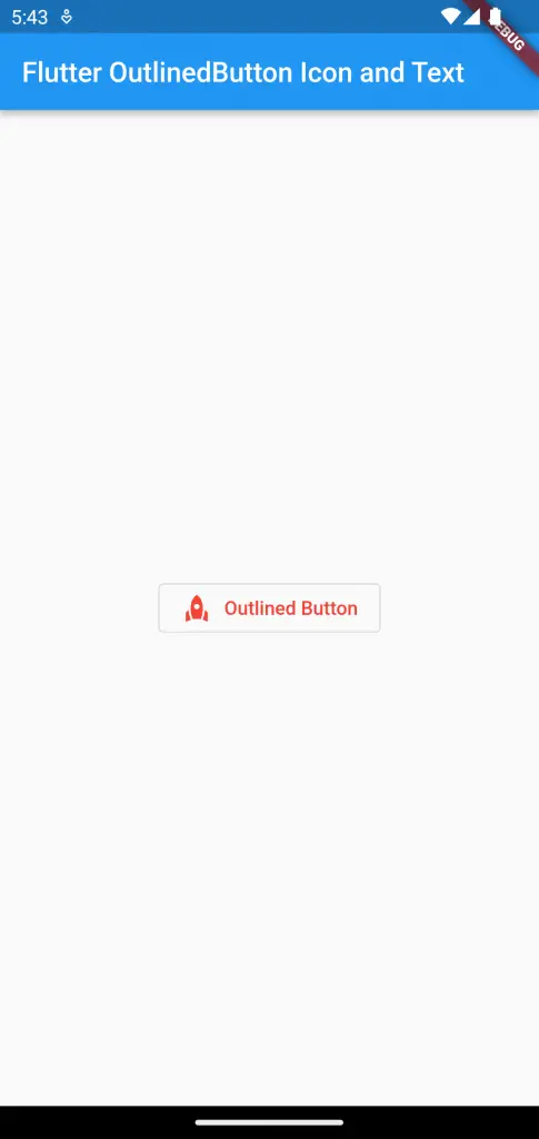
In order to show icon and text you should make use of the OutlinedButton.icon constructor. The icon and label properties help you to add both the icon and text in OutlinedButton.
See the code snippet given below.
OutlinedButton.icon(
          onPressed: () {},
          style: OutlinedButton.styleFrom(foregroundColor: Colors.red),
          icon: const Icon(Icons.rocket),
          label: const Text('Outlined Button'),
        )
Following is the output.
Following is the complete code for reference.
import 'package:flutter/material.dart';

void main() {
  runApp(const MyApp());
}

class MyApp extends StatelessWidget {
  const MyApp({super.key});

  // This widget is the root of your application.
  @override
  Widget build(BuildContext context) {
    return MaterialApp(
      title: 'Flutter Demo',
      theme: ThemeData(
        primarySwatch: Colors.blue,
      ),
      home: const MyHomePage(),
    );
  }
}

class MyHomePage extends StatelessWidget {
  const MyHomePage({super.key});

  @override
  Widget build(BuildContext context) {
    return Scaffold(
        appBar: AppBar(
          title: const Text('Flutter OutlinedButton Icon and Text'),
        ),
        body: Center(
            child: OutlinedButton.icon(
          onPressed: () {},
          style: OutlinedButton.styleFrom(foregroundColor: Colors.red),
          icon: const Icon(Icons.rocket),
          label: const Text('Outlined Button'),
        )));
  }
}
That’s how you add OutlinedButton with Icon and Text in Flutter.