How to Create Bottom Tab Navigation in Flutter
Bottom tab navigation is a new norm in mobile app development. It makes navigation easy for users. In this blog post let’s see how to add Bottom Tab Navigation in Flutter.
We use Cupertino package too in this Flutter tutorial. The Cupertino package consists of iOS style widgets such as CupertinoTabScaffold to create bottom tabs. You might be thinking why I am choosing a Cupertino widget instead of material widget BottomNavigationBar. It’s because the Cupertino widget supports parallel navigation out of the box.
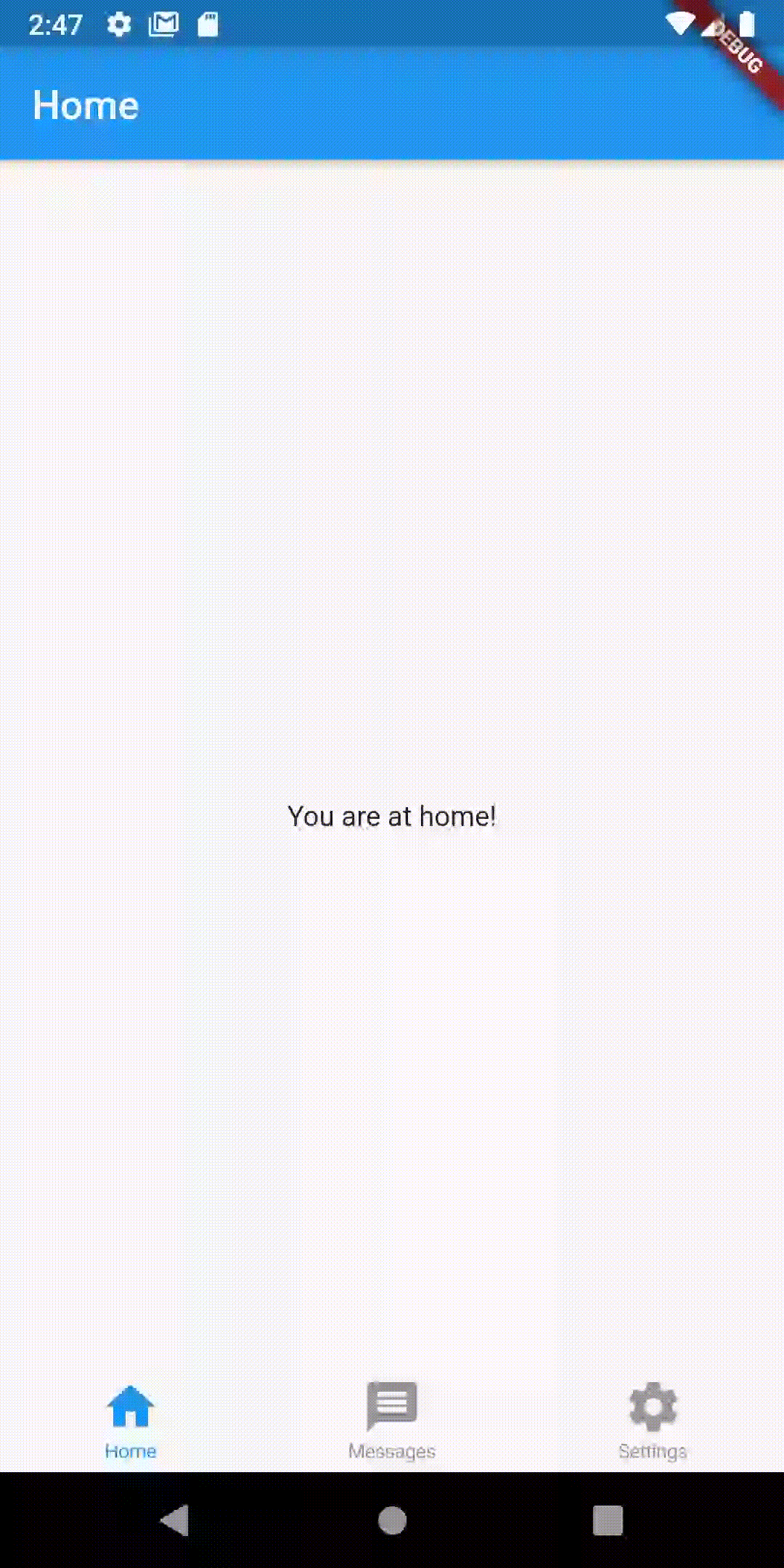
I am going to use three bottom tabs namely home, messages and settings in the following example. Each tab should have a screen so that navigation can be done when the tab is pressed. Following is the home screen.
import 'package:flutter/material.dart';


class Home extends StatelessWidget {

  @override
  Widget build(BuildContext context) {
    return MaterialApp(
      title: 'Flutter Tutorials',
      home: Main()
    );
  }
}

/// This is the stateless widget that the main application instantiates.
class Main extends StatelessWidget {

  @override
  Widget build(BuildContext context) {
    return Scaffold(
      appBar: AppBar(
        title: Text('Home'),
      ),
      body: Center(
        child: Text('You are at home!')
      ),
    );
  }
}
You may create the other two classes similarly.
Let’s come to the main point – bottom tabs. Following is the code of complete Flutter bottom tab navigation example.
import 'package:flutter/material.dart';
import 'package:flutter/cupertino.dart';
import 'package:flutter_bottomtab/home.dart';
import 'package:flutter_bottomtab/messages.dart';
import 'package:flutter_bottomtab/settings.dart';

void main() => runApp(MyApp());

/// This Widget is the main application widget.
class MyApp extends StatelessWidget {

  @override
  Widget build(BuildContext context) {
    return MaterialApp(
      title: 'Flutter Training',
      home: Main(),
    );
  }
}

class Main extends StatelessWidget {
  const Main({Key key}) : super(key: key);

  @override
  Widget build(BuildContext context) {
        return CupertinoTabScaffold(
  tabBar: CupertinoTabBar(
    items: <BottomNavigationBarItem> [
      BottomNavigationBarItem(
          icon: Icon(Icons.home),
          title: Text('Home'),
        ),
        BottomNavigationBarItem(
          icon: Icon(Icons.message),
          title: Text('Messages'),
        ),
        BottomNavigationBarItem(
          icon: Icon(Icons.settings),
          title: Text('Settings'),
        ),
    ],
  ),
  tabBuilder: (BuildContext context, int index) {
    switch (index) {
      case 0:
        return Home();
        break;
         case 1:
        return Messages();
        break;
         case 2:
        return Settings();
        break;
      default:
      return Home();
    }
  },
);
  }
}
As you see, we use CupertinoTabScaffold and CupertinoTabBar to create bottom tabs. Each bottom tab is defined using the BottomNavigationBarItem widget. We return assigned classes to the matching indices for the proper navigation.
Following is the output of the Flutter Bottom Tabs example.
You can get the full source code from this Github repository.
You can also learn how to create a navigation drawer in Flutter.
One Comment