How to Show Material Icons in Flutter
Icons are important aspects of the mobile app user interface. Material icons are those which follow material design guidelines and they can make your app look more beautiful. In this blog post, let’s look at how to add material icons in Flutter.
You can show material icons using the Icon widget. You can add an icon as follows:
Icon(
  Icons.add,
  color: Colors.pink,
  size: 30.0,
)
In the above code snippet, add is the icon name. You can go through the list of material icons given here to see the availability. The color property is used to define the color of the icon whereas the size property defines the height and width of the icon.
Following is the full Flutter material icon example:
import 'package:flutter/material.dart';

void main() {
  runApp(const MyApp());
}

class MyApp extends StatelessWidget {
  const MyApp({super.key});

  // This widget is the root of your application.
  @override
  Widget build(BuildContext context) {
    return MaterialApp(
      title: 'Flutter Demo',
      theme: ThemeData(
        primarySwatch: Colors.blue,
      ),
      home: const MyHomePage(),
    );
  }
}

class MyHomePage extends StatelessWidget {
  const MyHomePage({super.key});

  @override
  Widget build(BuildContext context) {
    return Scaffold(
        appBar: AppBar(
          title: const Text('Flutter Material Icon Example'),
        ),
        body: const Center(
            child: Icon(
          Icons.verified_user,
          color: Colors.teal,
          size: 100.0,
        )));
  }
}
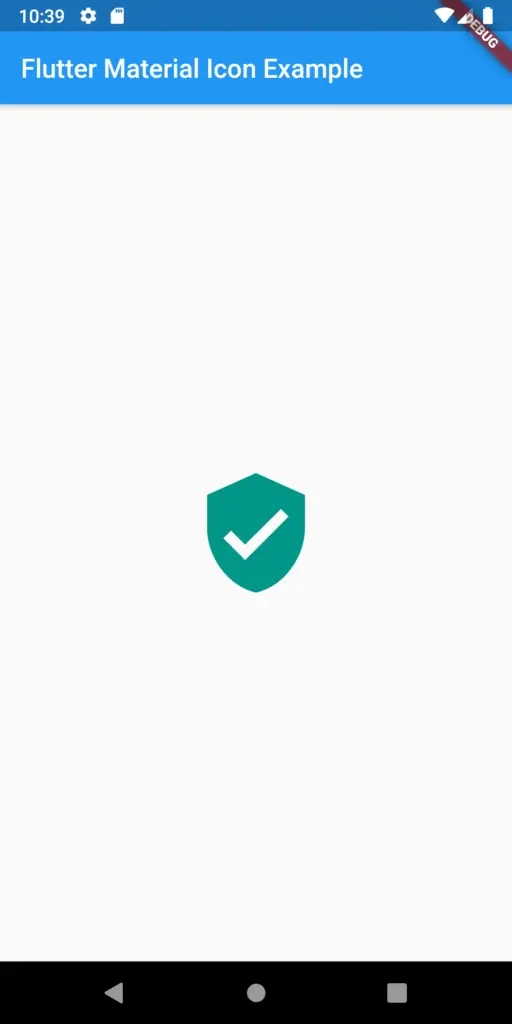
The output of flutter material is as given in the screenshot below:

If you want to create an Icon button, then check this blog post on the Flutter icon button.
That’s how you display material icons in Flutter.
